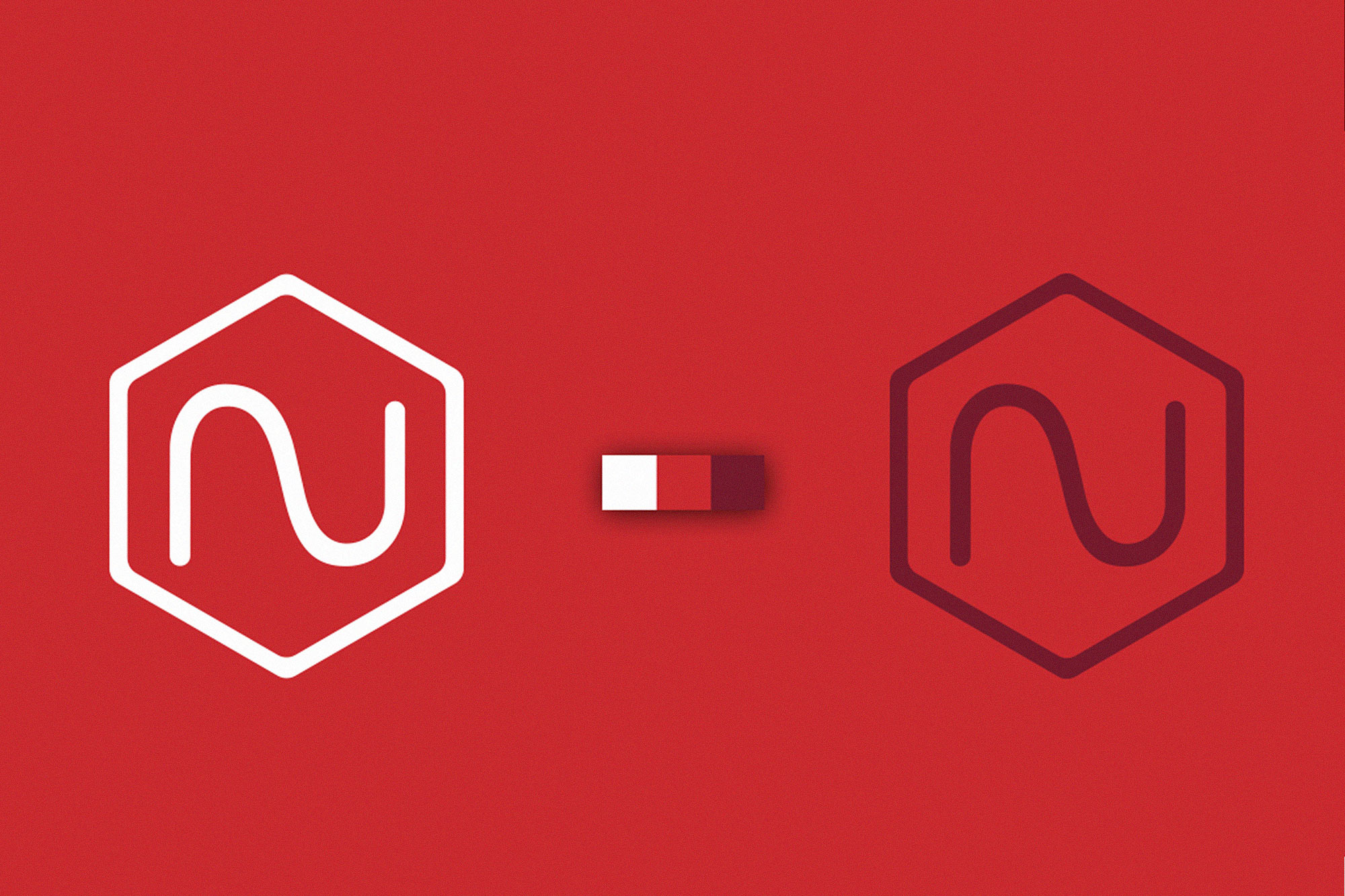
Because my name is quite long and I wanted a symbol that would stand out while remaining simple, I decided to create an “N” that, when reversed, resembles an “S,” representing my surname — Santos Nassetti. The “N” also symbolizes my online pseudonym, Nokcturna. I chose red and white as the main colors because they are my favorites. Although white is technically the absence of color, I love using it in my work to create space, clarity, and simplicity.
“White is the combination of all colors in the visible spectrum. It is often defined as ‘the color of light’ in pigment theory. It reflects all light rays, absorbing none, which is why it appears as maximum clarity. It is one of the most common colors in nature — the color of sunlight, snow, milk, chalk, limestone, and other common minerals. In many cultures, white represents purity, innocence, and light, and serves as the symbolic opposite of black, or darkness. According to research conducted in Europe and the United States, white is the color most frequently associated with perfection, goodness, honesty, purity, beginnings, novelty, neutrality, and precision.” Wikipedia