May 20, 2017

My interest in design began when I was about 13, in a way. I wanted to understand the whole point of having a blog at the time, so I created one. Over time, that grew. I was very interested in web design, in addition to markup languages (HTML) and style sheets (CSS) as well. I learned a lot of things. I would even create the code in the notebook upside down when building a website. At the time it was just a hobby, something to spend time with and which later became a passion.
After so much time, about 15 years really, seeing how much I have evolved in my work makes me extremely happy. Not only in the web itself, but in the design in general. Graduating from the Panamericana in 2014 only made me even happier and more confident with my work, and it helped me a lot to remind me how much I loved to draw — which is topic for another post.
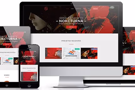
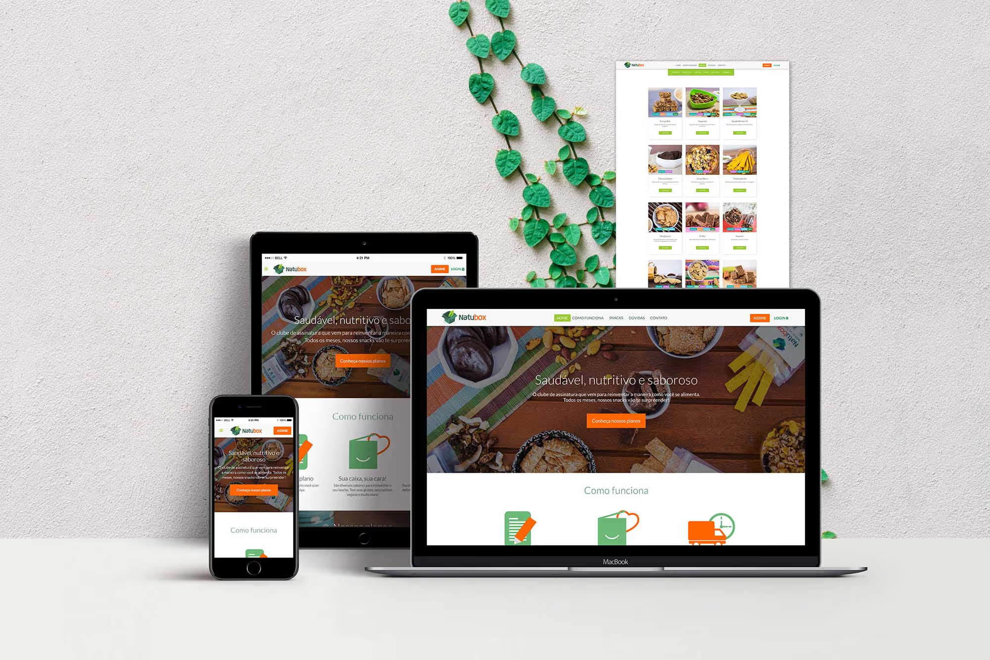
So let's go back to Natubox! It's a company that was born out of a passion as well. In this case, the passion for healthy eating. In partnership with AssineStore, I was hired to design and front-end their site. I felt so high when I saw that complete and impeccable briefing, hahaha. All the information, from what they wanted and they expected the brand's personality and target audience, which were extremely well detailed. A dream. The design flowed, of course.

Because it is a site focused on healthy food, I tried to make the site simple, easy to understand and, above all, minimalist - to reflect the type of product and also to be part of my work style. The colors, as requested by the customer, were inspired by the brand's own colors, in addition to soft gray tones for the use of plain text. I chose Lato as a font because it is very readable and pleasant.
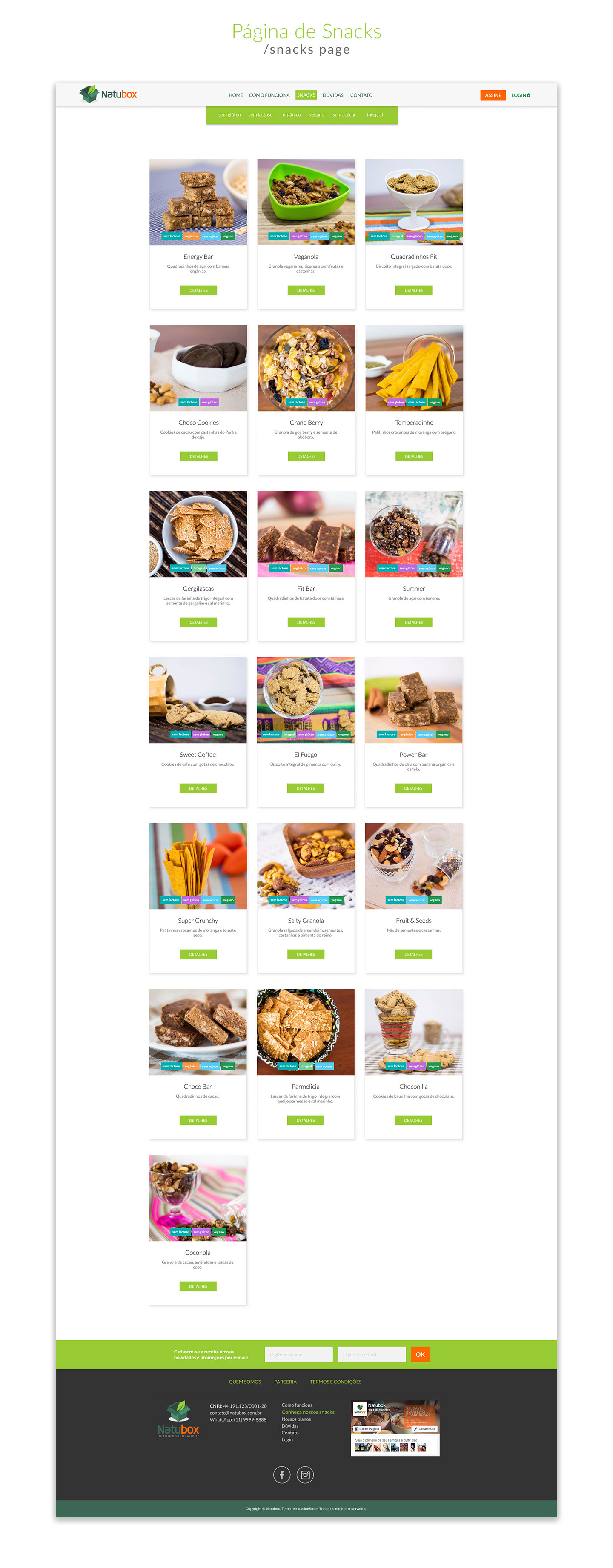
Each snack (when clicking on details on the snacks page) opens in a popup (at the customer's request). Each popup contains all the product information: ingredients, nutritional table... in addition to a more detailed description and a larger photo of the snack.

I left the background fixed and kept the scroll bar when opening the popup precisely because, since there is a lot of information, it was undoubtedly necessary. I even thought about making something 3D, maybe a flip to show more information (such as a nutritional table), but then the customer would have to click another button to see more information, and the idea is to simplify as much as possible, so I kept it that way. More practical and more pleasant.
The page for adding snacks - which comes right after the person chooses a plan - was designed to maintain the design of the snacks page, but with a Plus: a column where each selected snack appears, informing the customer how much is left to complete the box. There are two plans: 10 snacks and 18 snacks. The 18 would certainly exceed the screen size, so I kept the same as I did for the popup: scrollbar and fixed background (something that changed later when programming, because the customer wanted the column always open).

The wonderful photos taken bythe photographer Stefani Spaniol. I edited the images to fit the appropriate size for the product headers and cards. NOTE: It wasn't easy not to feel like trying the snacks while editing, hahaha.
Fernando from AssineStore was responsible for programming and system adaptation. AssineStore, in fact, is a company focused on creating subscription clubs and stores. If you need to create one, get in touch! They already have some standard templates (created by Pedro Pellicano). I also made one that will still air and will do more in the future), but if you need a custom template, it's with me or Pedro ;)
Another really cool thing about the templates is that, once ready and adapted, the client then has total freedom to edit the sections, information, etc.
I loved being a part of this project. It was a really good challenge to have to think a lot about the experience and user interface. I've been learning a lot in recent years and UI/UX is undoubtedly fundamental to any design. And may more projects like this come!
In fact, I'm seriously thinking of subscribing to Natubox! Look at these photos! Doesn't it make you want to try it? I love snacks and I confess that I abuse it from time to time... I think this is a good opportunity to seek healthier options.;)
You can check out more about the project here.