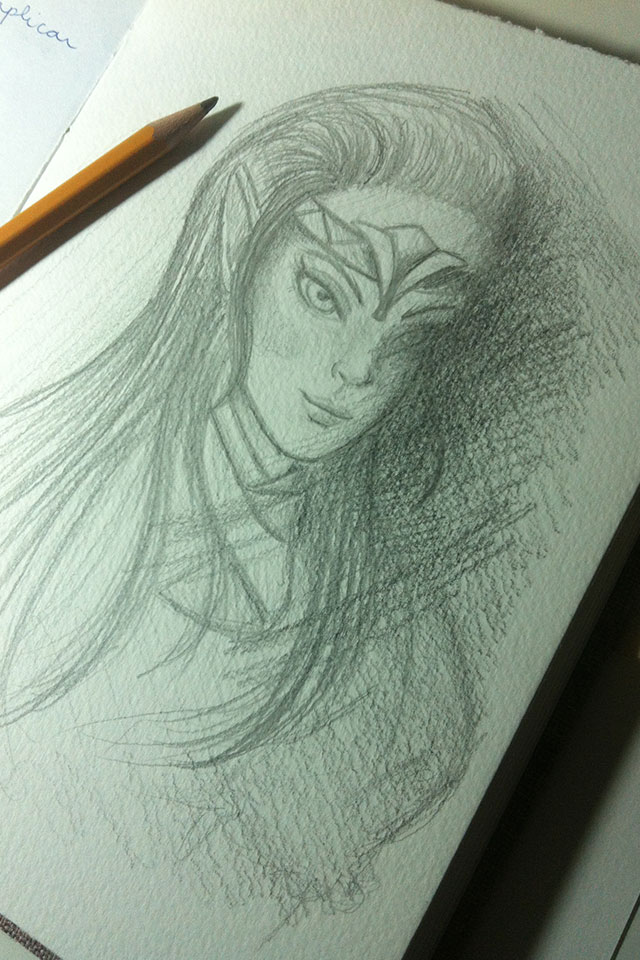
The week was very productive! I took the opportunity to draw a lot, go back to watercolor too (I haven't trained in a while)... and I even achieved an incredible result in a new Simone Simons fan art! I would even say that, of the fan arts I made of her, this was the one that had the best result, hahaha. It was an interesting mix of quasi-realism with drawing and my style.
Shall we go to the cartoons, then?
A photo-based study that was part of a course module :)
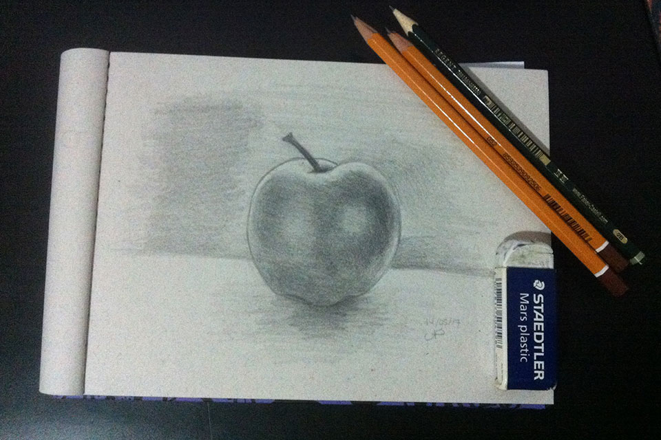
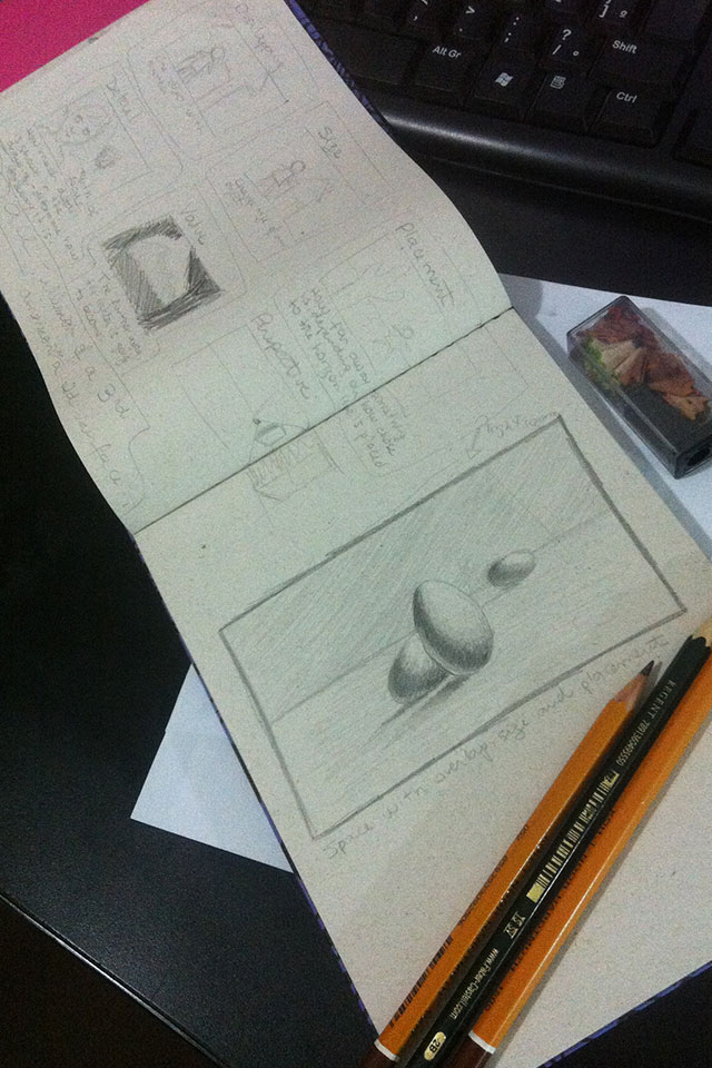
Some studies that were part of the course as well.
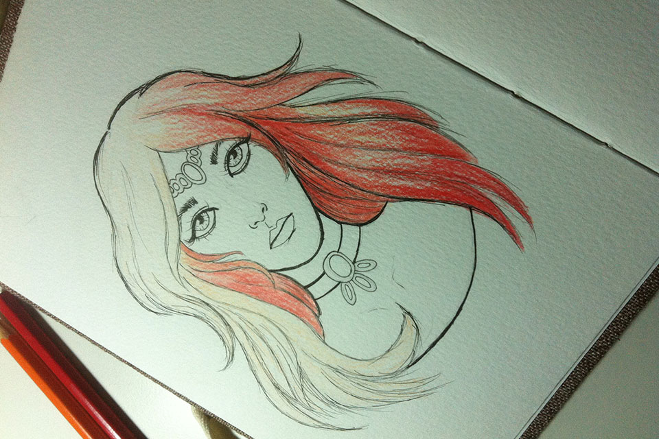
A quick sketch that I did (without reference) to train a bit. In that one, I decided to play a bit with colored pencils again, hehe.
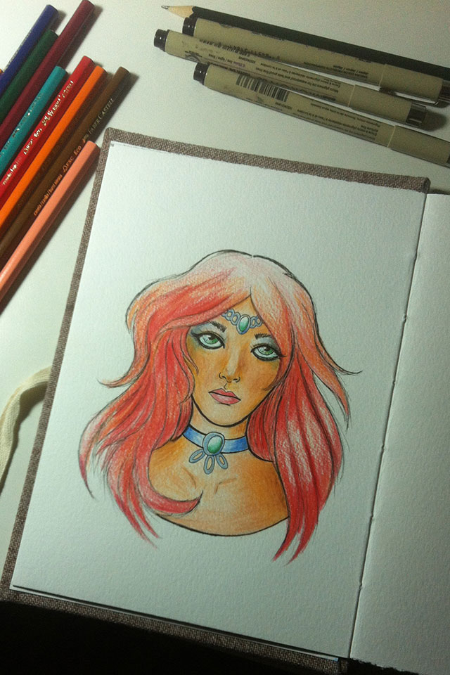
Final result. I didn't like it very much, to be honest. I thought I weighed too much on the colors on my face, but overall it was interesting. NOTE: That's what you can do without drawing for a while! We lose a few tricks, hahaha :p
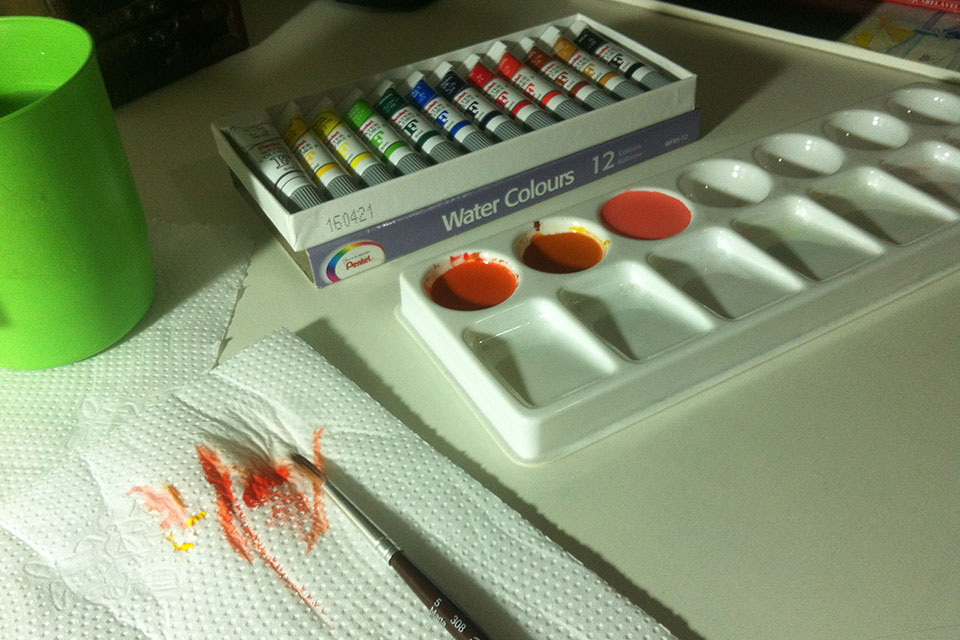
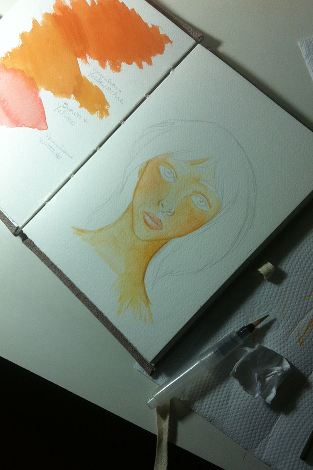
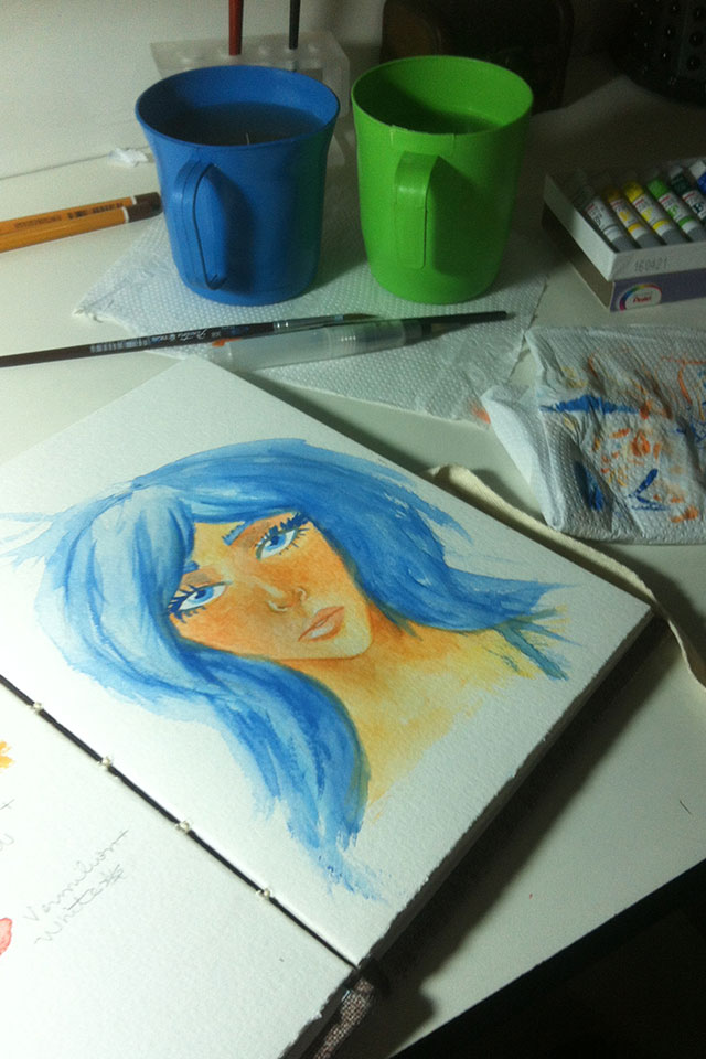
Then I decided to create another basic sketch and play with my new watercolors! I used to use watercolor in tablets and that was the first time I decided to test watercolors in tubes. The very clear difference is that with the tablets you end up using less ink and the tube ones you generally end up creating more ink than necessary... but I believe it is something that over time we learn to control and understand how much paint you will need for a given painting. In addition, since I had a lot of colors in tablets, I didn't usually have so much need to mix colors, something that changed when I decided to use tubes. And it's great because that way I could train this more, hehe.
Result of the game. It was really fun and interesting to go back to watercolor. I plan to do more in the future, for sure. I miss making a mess, hahaha.
Study by course, using shadow tones to create volume for the drawing. In fact, a tip: whatever is close in your drawing (depending on where you want the focus to be), will have darker tones, and whatever is farther away will have lighter tones to create this effect. Another cool tip is to observe the world around you. You will notice this effect even better.
A quick sketch in pencils to warm up. NOTE: this “effect” that appears in the drawing is because the paper has a bit of texture.
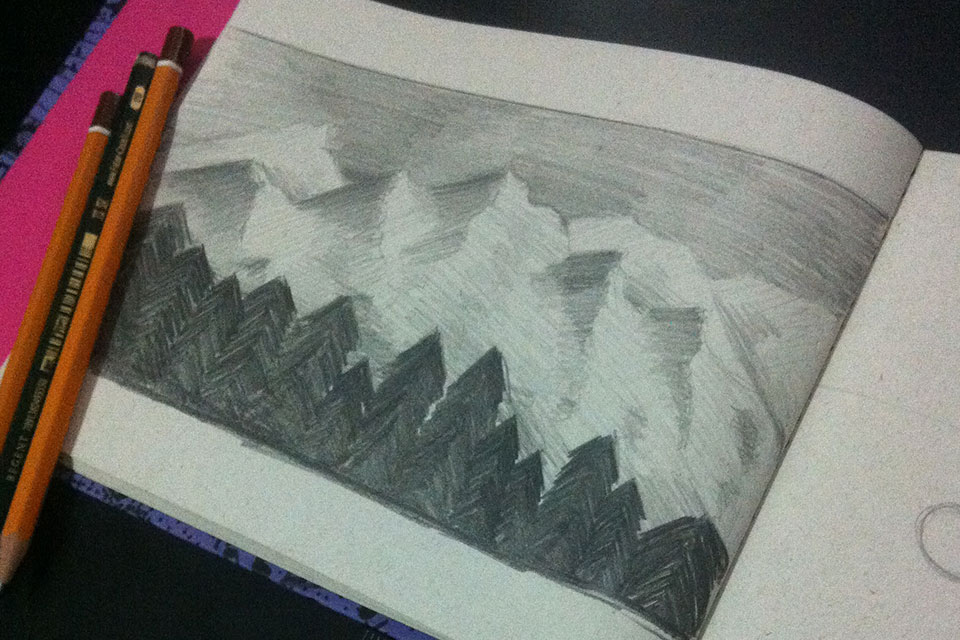
Another quick sketch to train with.
Hehehe. A game to warm up and train hand drawing, hahaha.
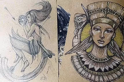
After watching some videos from the course's perspective module, I decided to play around a bit with a reference image of the game Mirror's Edge. I even want to go back to finish this drawing again, hehe. It's a sketch right at the beginning, just a study of position and everything else.
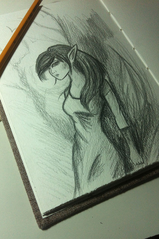
Another quick sketch. I didn't like it very much, hehe, but it was worth it to warm up XD
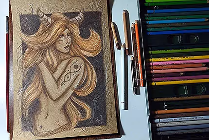
That one I really liked the result. I used an image only of the body (position) as a reference, but the face was completely upside down and without reference, hehe. In fact, I love shading (you can tell, right? haha), but this one would even be interesting to redo and with lighter shading. If you notice the first photos, it was also very interesting. I think it would be cool even to test a more flat and minimalist style.
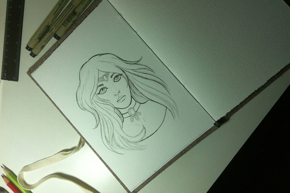
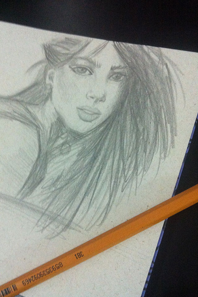
Another basic and quick sketch.
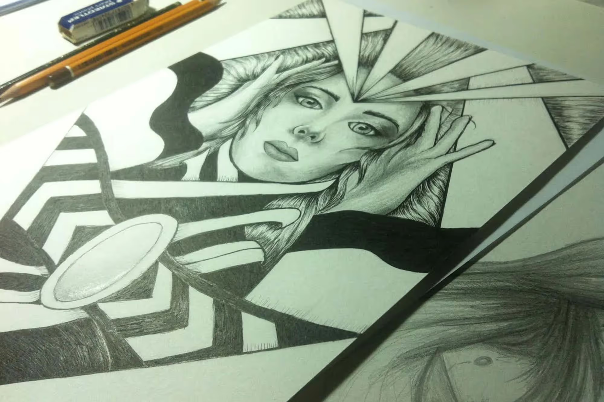
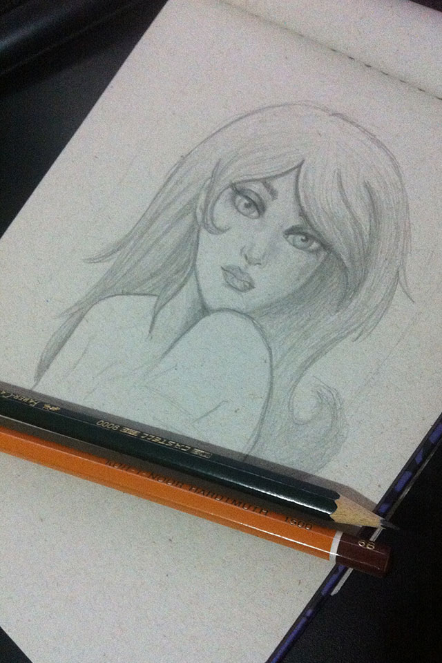
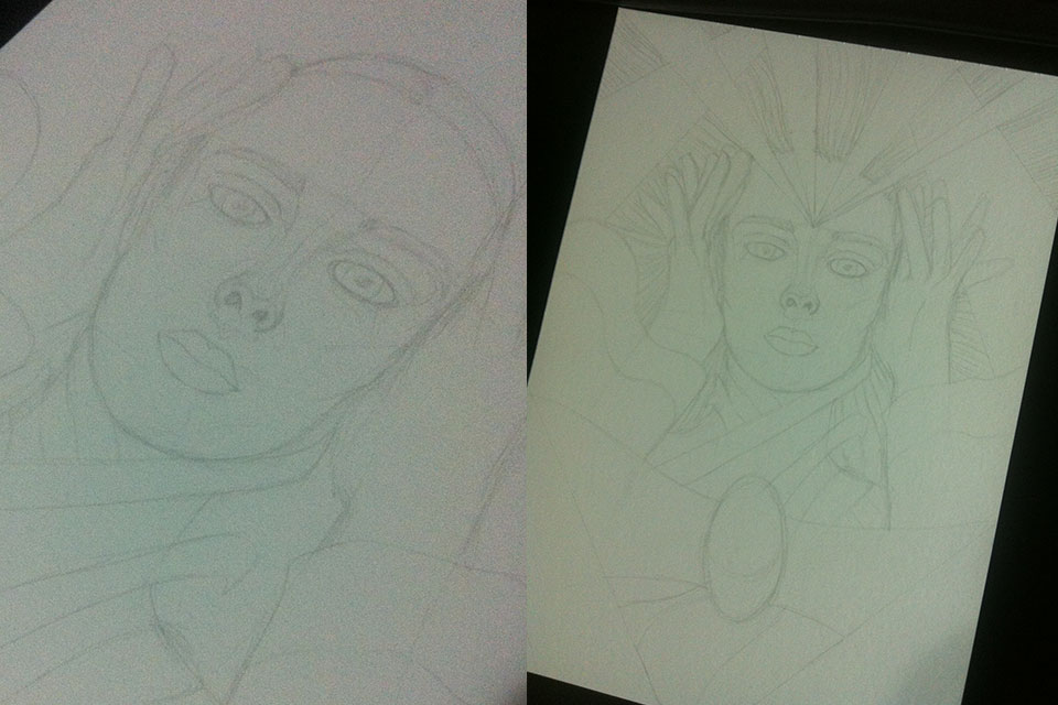
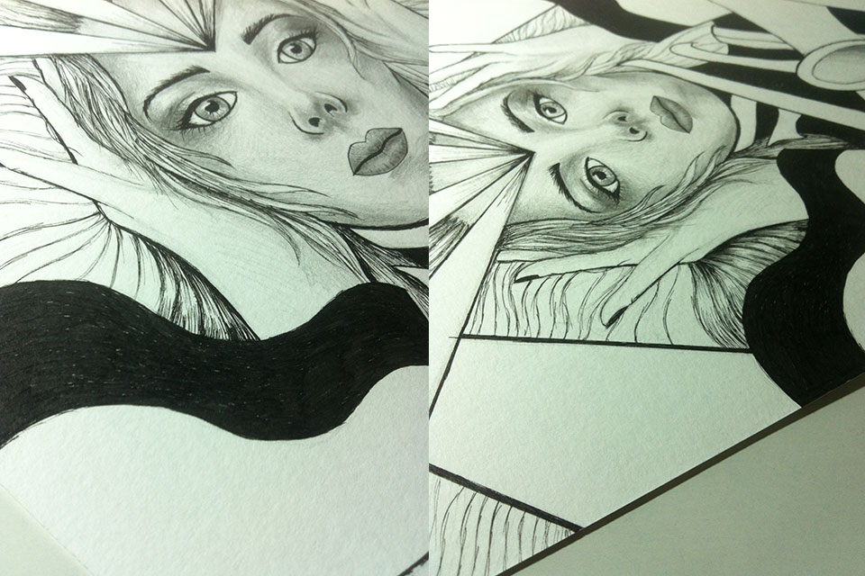
Here is the beginning of my last cartoon inspired by a photo by Simone Simons, my favorite singer. The idea at the beginning was really to do a more in-depth study of the image, to leave it intact, but I realized that I no longer have the patience for that. I love to move on to something more authorial, to let the drawing flow. And that's how one of the drawings began that lasted a whole day to finish, hahaha.
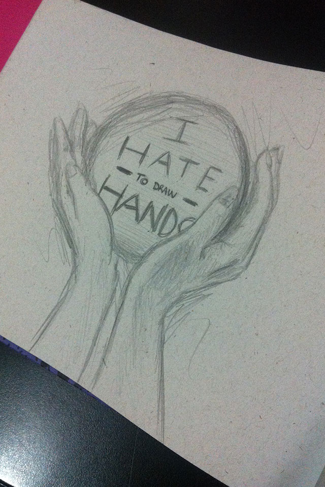
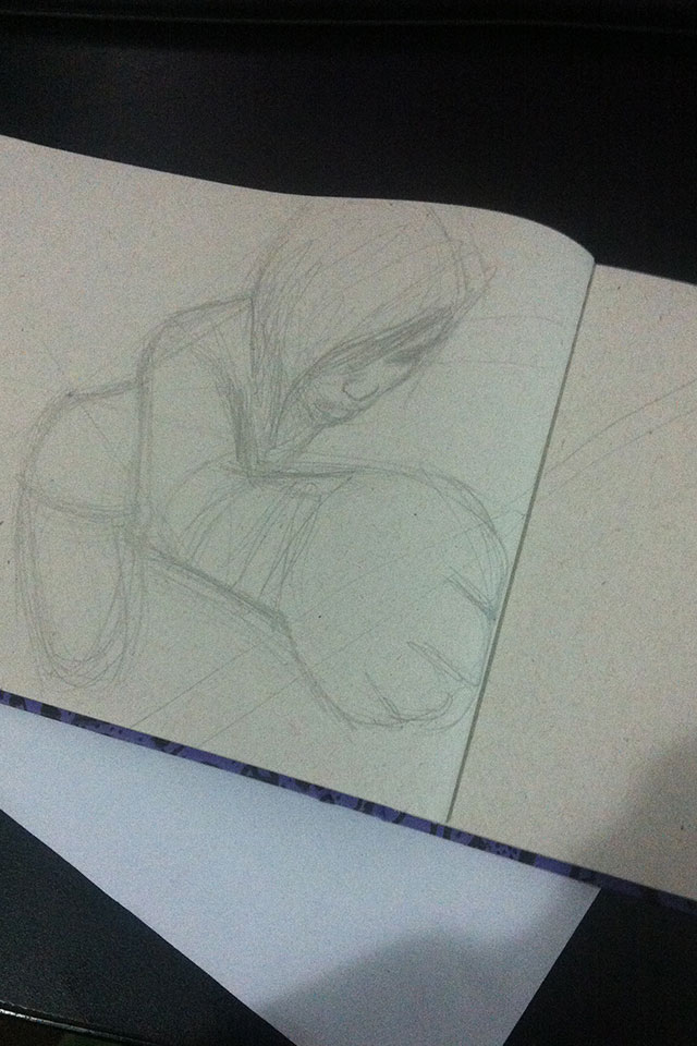
Some more photos of the process. Since I'm not a big fan of drawing hands, but I need training (of course), I've lately been opting for images that force me to train more in hand drawing, just as I did in the beginning in 2013 when I started training drawing faces. It's even a good way to learn. Here's the tip;)
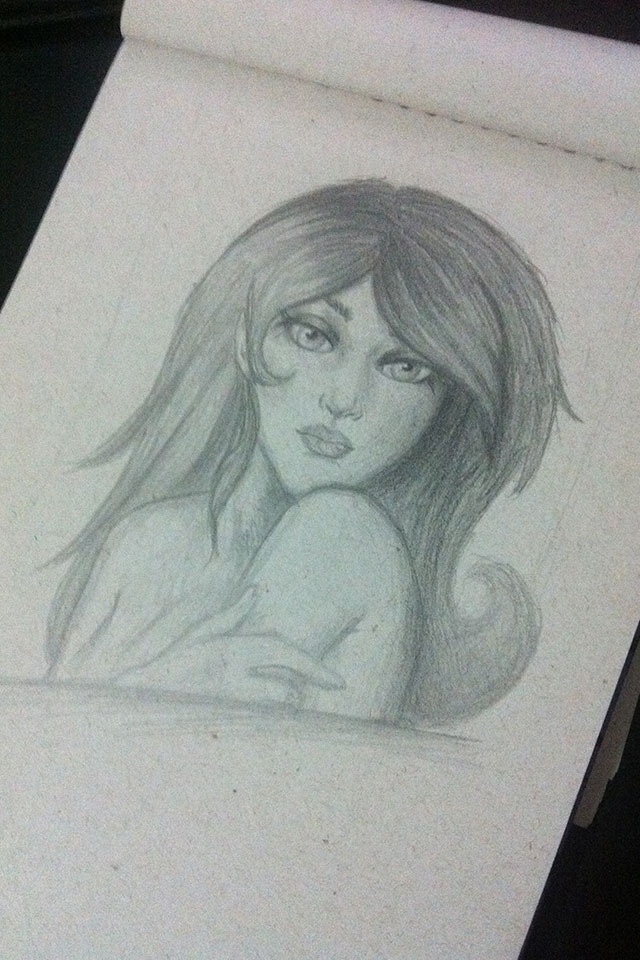
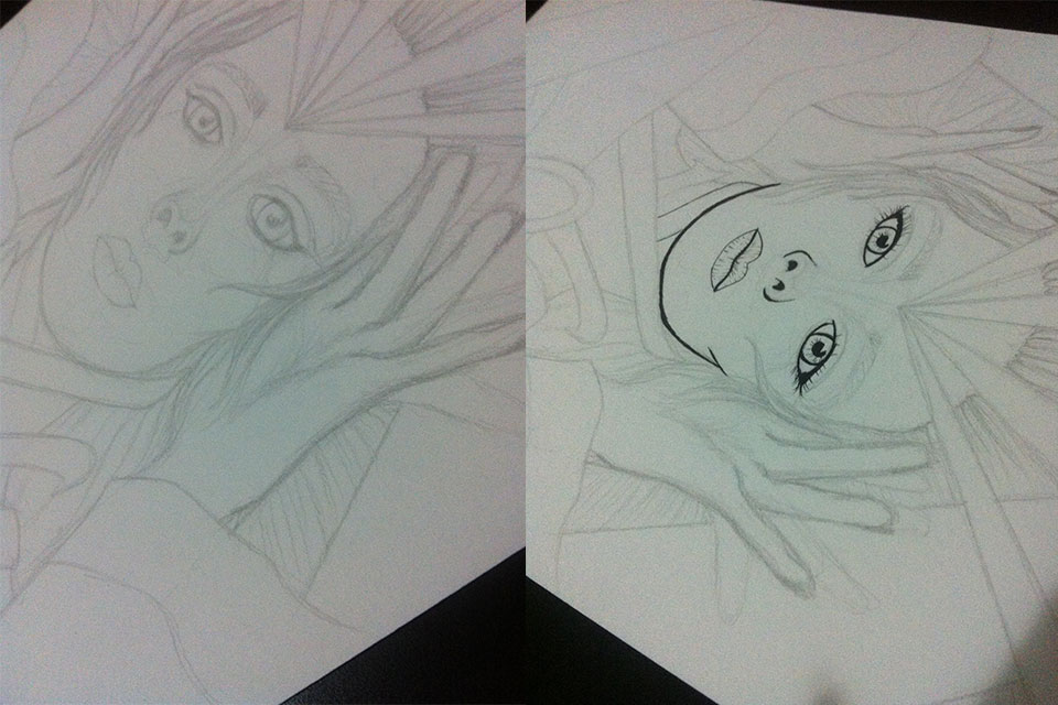
Since I've never tested the use of ink + pencils in a drawing (usually it's always one or the other), I decided to do the test with this one. The result was even better than I could imagine. In fact, in the case of the hands, I even thought of keeping the extra fingers that I had done (the result of a better positioning study) to create a kind of “psychedelic” effect, haha. But I decided to make it cleaner even so that I could see where I would end up with the drawing of the hands, since I'm not so used to drawing them.
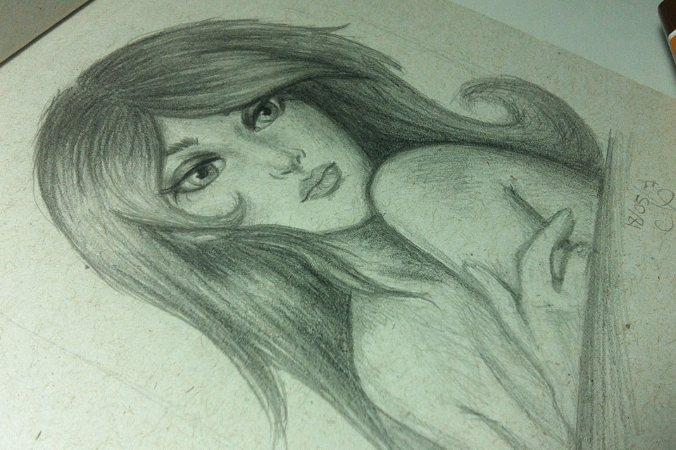
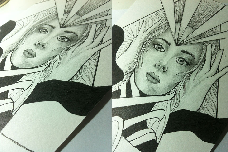
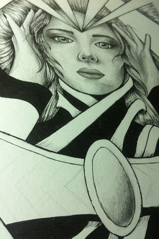
It was, without a doubt, one of the best results I obtained, especially when drawing Simone Simons. I've done other fan arts of hers, but this one is the best, precisely because it combines a bit of realism with my own style of drawing. I always came close to achieving something realistic, but in this work I saw that I improved a lot! Simone, being beautiful and one of my favorite singers, deserves the best, doesn't she? And at the moment it's my best, haha. I don't particularly intend to be the “designer of realistic drawings” — I admire those who follow this path, obviously. It's not easy to arrive at extremely realistic results. Observing elements around you and being able to reproduce them on paper or wherever it is in a perfect way is commendable... but I prefer to try to create a point between the two to create something that defines my drawing itself, a unique style that people can look at and say: this drawing is from Nokcturna, haha.
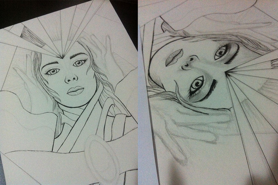
Another tip: draw hair in ink. I usually create a base for them (the lines you see in the photo above) so that they look loose and moving. The idea is to follow the path of your drawing and then the parts that are covered by something - in this case hands or surrounding elements - are the parts where you are going to create more lines and lines, leaving them dark and merging with the rest in a subtle way. In the middle always leave a slightly lighter area (dark, light, dark). I don't know if I was able to explain it well in text, hahaha, but just ask any questions. Oh, it's almost the same scheme that I made in my old drawing (which I posted in the edition) #14 of the Drawings of the Week). hath video on Instagram that can help. It's basically that, only with lines with less space between them. Separate as if they were small locks of hair. It's laborious, but it pays off in the end.
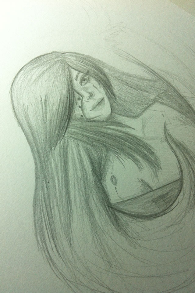
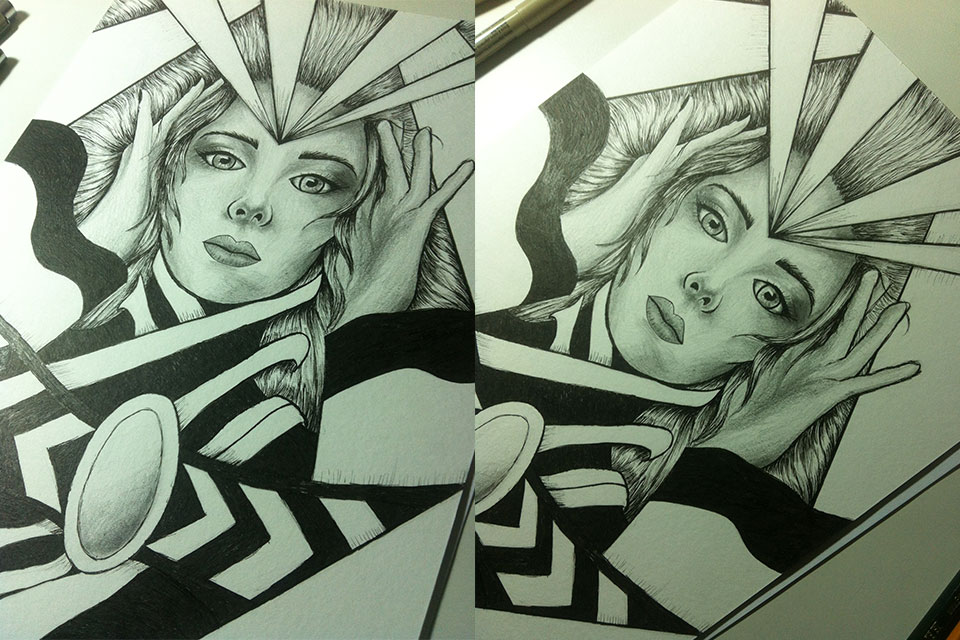
Photos of the final version. I think you can better see the hair effect I mentioned, hehe:)
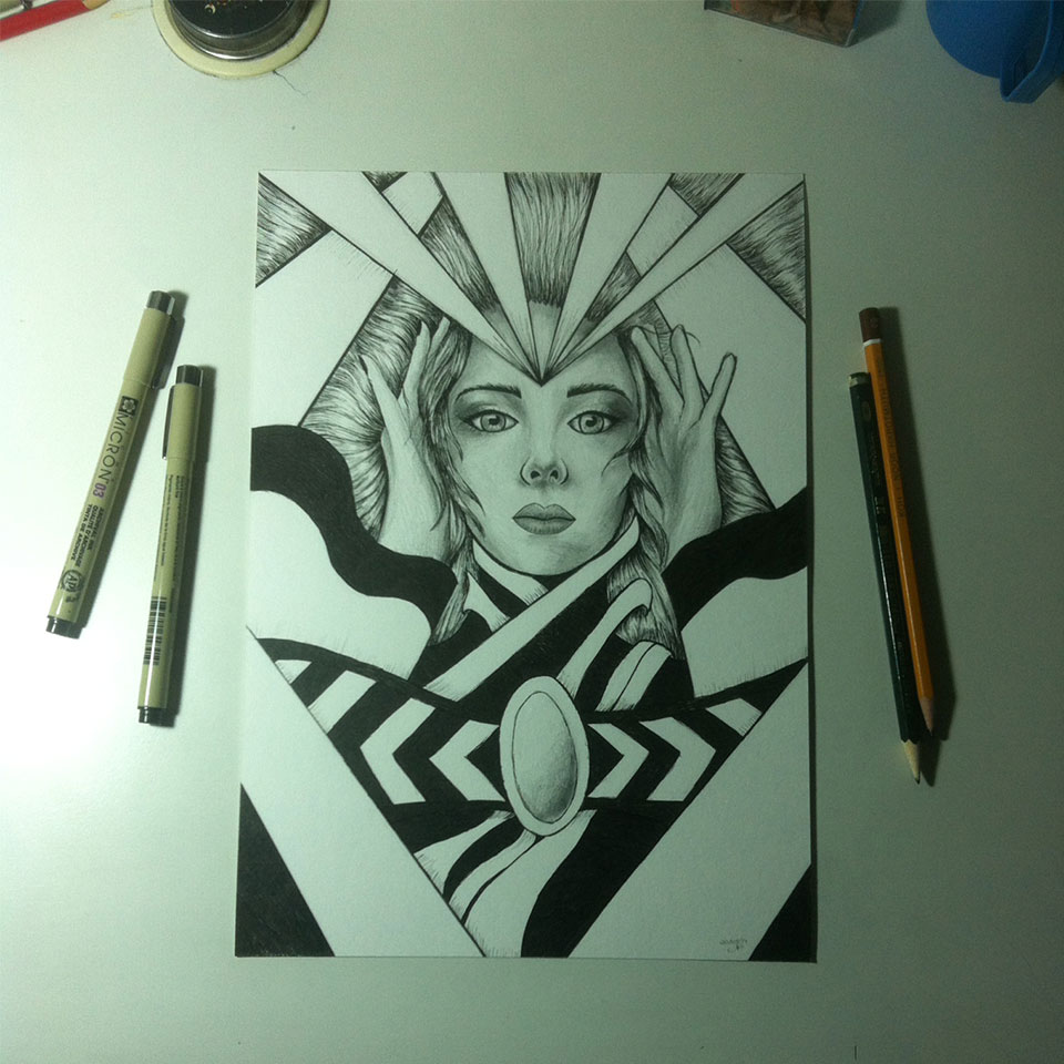
Photo of the finished drawing.
I apologize for taking a lot of photos at different angles, it's a craze, hahaha... but I think it's because I love to see my drawings from other angles and also because I love to photograph. It's a way, perhaps, of combining the two passions into one thing :)
I hope you enjoyed today's post! There will be more next week! ^__^