Second post in the series Designs of the Week! \o/
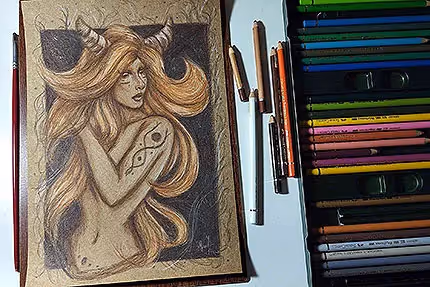
This week I decided to train a little more with colors to get out of my “common place”, since I generally tend to draw in pencils and, now, training more ink, I decided to combine some styles.
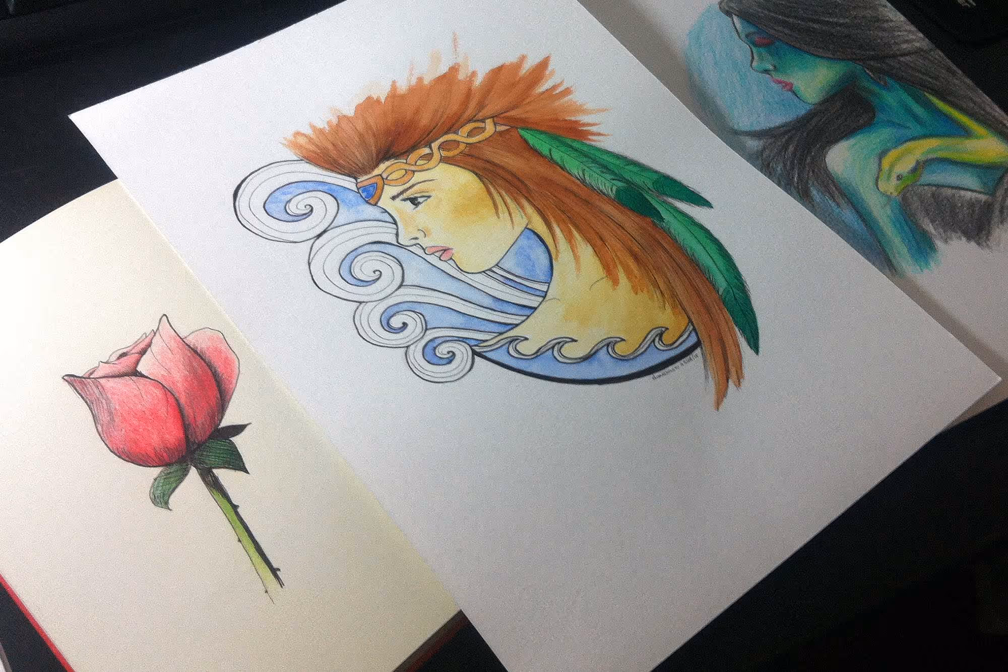
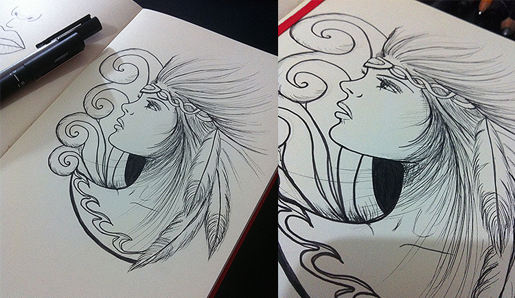
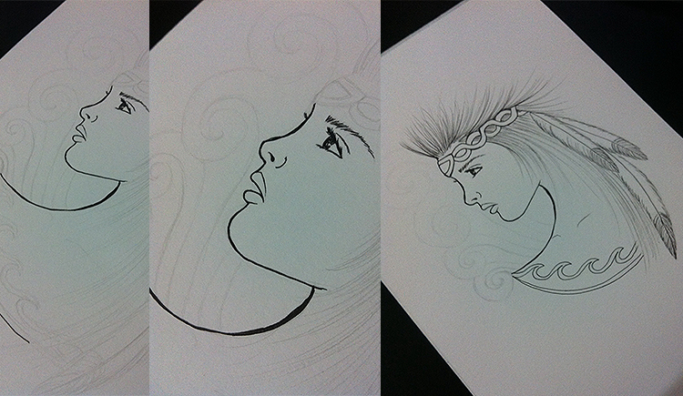
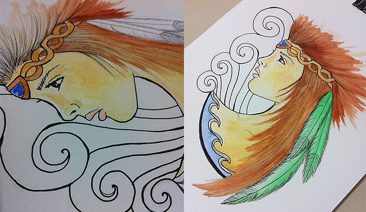
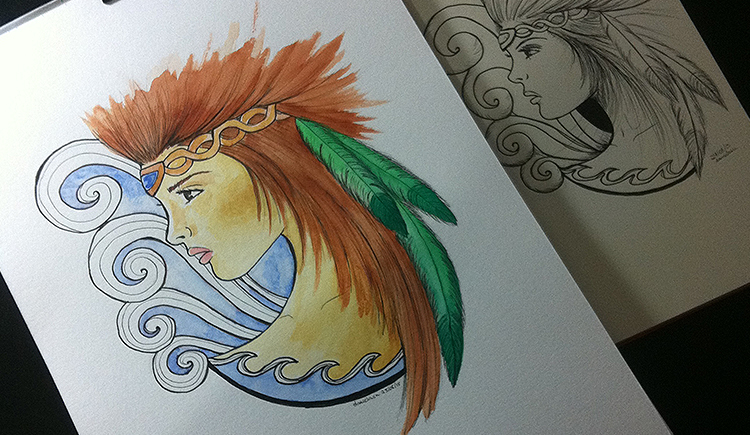
I made a very cool sketch — in pencil and then ink — inspired by something Indian and with ornaments. Since I really liked it, I decided to make a version in ink + watercolor as well. I drew it from scratch again on Canson of 300 g/m² (which was cool, because it turned out to be even more beautiful, haha), I outlined it with ink and painted it with watercolor. You can check the result and photos of the process below:
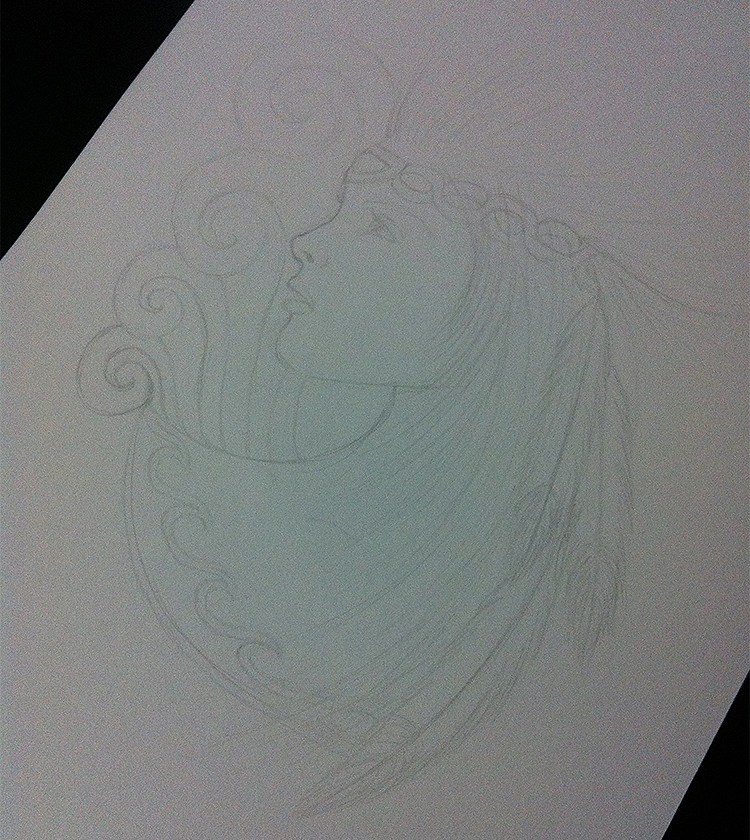
Still an early stage — pencil sketch. So far so good, haha.
I confess that I had a bit of difficulty ironing the ink at the beginning, because the tip is very thin and the paper is very thick, the pen sometimes ends up “sinking” into the paper, which gets in the way a bit.
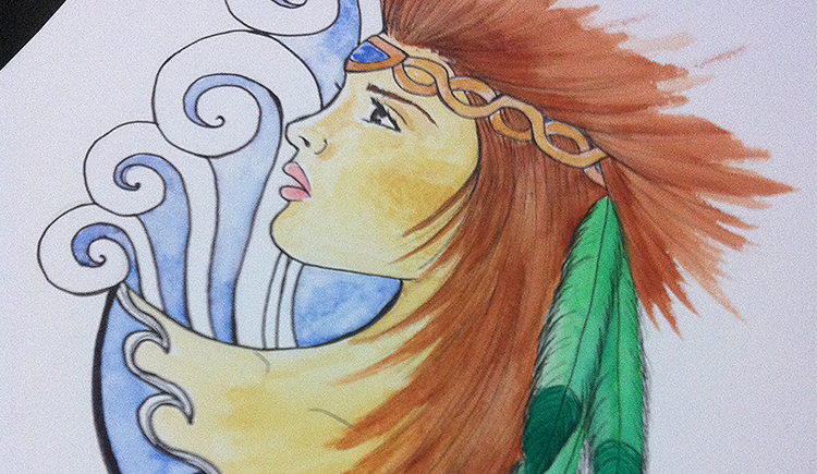
It was time to paint that the fun began! I need to learn more about how to mix colors, however, to give a better result for skin tones (I should have played a little more pink tones...), although I liked the way it turned out.
I ended up discovering something cool that I'm going to teach you: can you see the blue in the ornaments? So, first I painted it with a very light blue, let it dry... and then I applied it again (to create those darker areas), but the cool thing is that when you iron it well, take a piece of paper over the area you just painted (it could be those ordinary paper napkins anyway), I managed to create a very cool transition effect between the two blue ones! I was even upset that I learned to do this only after I painted the jewel on the tiara, because it could have had a better effect there, hahaha.
The final result is the old sketch in Nanking next door:)
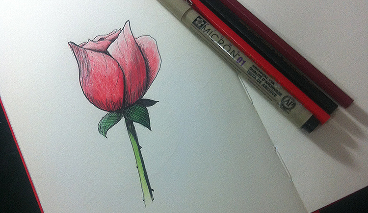
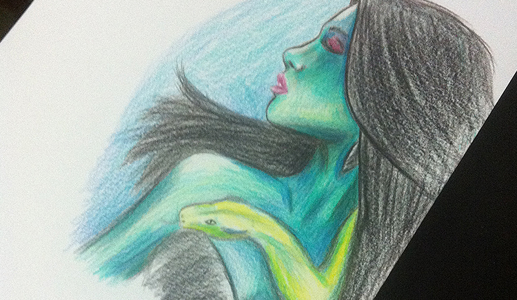
This design was basic to train the use of ink to create shadows (hatches). Then I had the idea of painting with colored pencils to play with. It ended up giving a really cool effect:)
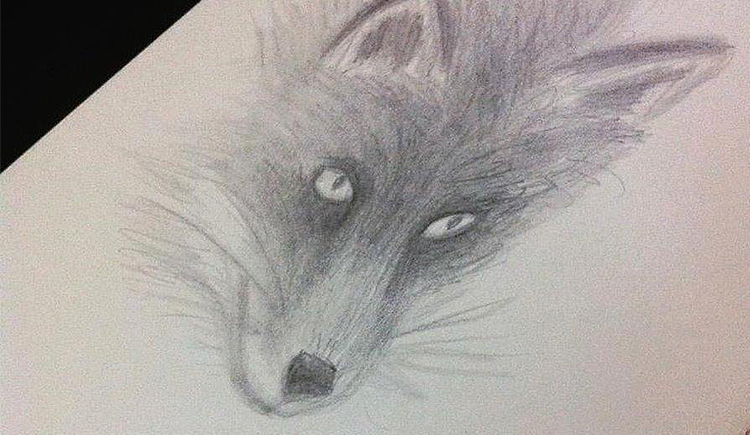
I'm not very used to drawing animals (although I generally like to draw birds, haha), so I made this very basic sketch of a fox, in pencil, just to train.
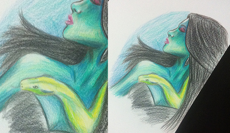
This drawing was based on a reference - the poster for the new season of the series A Drink in Hell (From Dusk Till Dawn). It turned out that I went another way and created something more authorial. I have these tendencies to get away from the initial idea a bit when I discover that I can do something more “cool”, haha. I thought it was really weird, but I ended up liking it because of the colors. It was really fun trying to play with colors other than normal skin tones to delimit light and shade values!
That's it for today, guys! There will be more next week!