Jul 30, 2017

This week was really fun! I took the opportunity to buy new materials and do some tests... a shame that my Canson A4 blocks (which I usually use to make my drawings) haven't arrived yet, so I was left alone with my sketchbook, hahaha ): they should arrive next week!


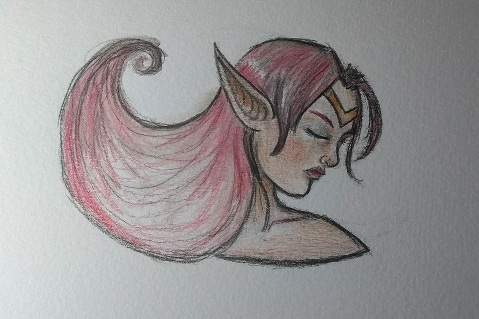
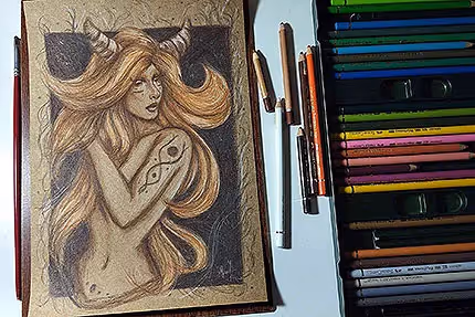
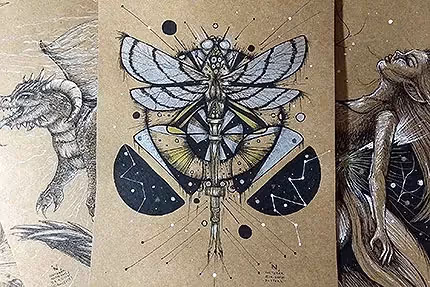
In addition to the pencils that I used the most and mentioned in the previous images, I also bought a gold ink for calligraphic writing. Actually I don't intend to use it for writing but to apply it to my drawings as an extra finish. I haven't said much about it yet because I want to test more and see what I can do. In addition to him, two pastel pencils too, because since I'm thinking of buying the Polychromos from Faber Castell, I wanted to test first - since the investment will be large. And yes, they are wonderful, hahaha.
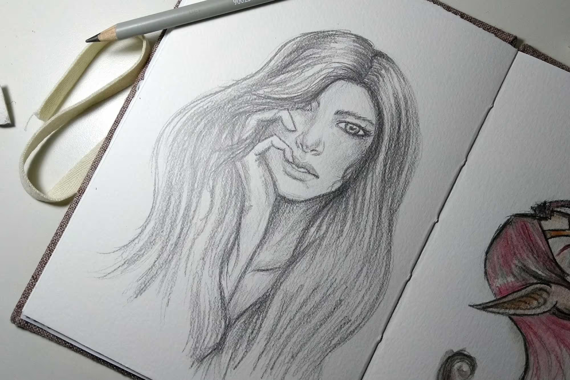
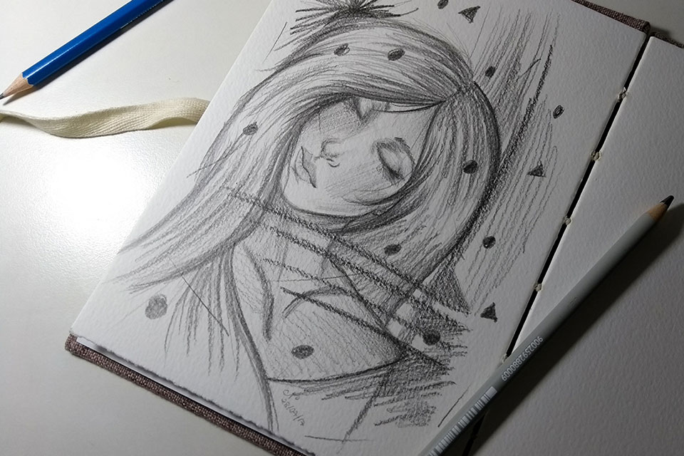
Oh and the texture you see in the drawings comes from the sketchbook paper — Canson Montval 300m/g² paper, which is lightly textured. By the way, I had this sketchbook in the photo a while ago. I bought it from a site that makes handmade sketchbooks (Entrelacé, but they changed the name to Studio Interlace, by the way).
I currently have around three sketchbooks that I use for different purposes, hahaha. One (with paper around 80-90m/g²) I use only for drafts of design projects — UI/UX, websites, logos, etc.; another for simpler and faster drawings (also in the same weight range as the previous one); and the one for the photo (300m/g²), for drawings with colored pencils, pens, watercolor, etc. I always recommend that when you work with materials such as watercolor, pens, etc. you use papers around 300m/g², so you don't run the risk of paper tearing and losing your art, The paper is thicker and prepared to hold up to a snag (haha).
Remember: always have a sketchbook by your side. Take it with you in your bag/backpack wherever you go. You never know when inspiration comes and that desire to draw beats ;)