And here we are in the third post in the series Drawings of the Week!
I believe that I have reached an interesting stage where I can dedicate myself better to each drawing — I want to have an idea and finalize it well instead of creating several random things and leaving it unfinished. Not that it's bad to do some doodling here and there (I learned a lot of things like that, haha), I still do it, but at the moment it's more advantageous for me to dedicate myself to a specific project or two projects a week. By dedicating myself, focusing on a specific illustration, I am able to finalize it better and learn more during the process.
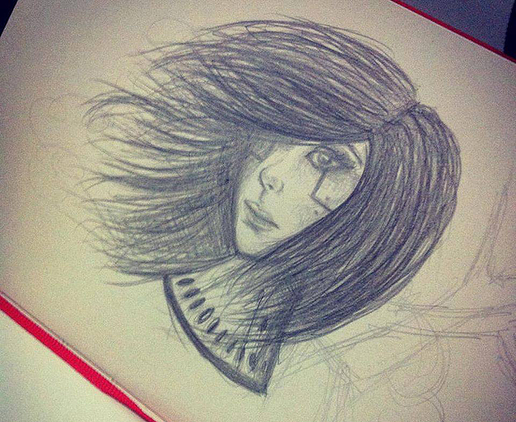
The craze of doodling from time to time still persists and I always encourage it. Here's an achievement this week without reference, hahaha.
This week I made a really cool illustration that served both as a study and as a way to recognize my own style, so I decided to focus only on it. Those who know me know that I love video games, and from time to time here and there I make some Fanarts (subject that will be addressed with several photos of some of my old illustrations in a future post), especially from the franchise The Legend of Zelda. I love Princess Zelda and because of that I have already done several illustrations of her, but the ones I did this week made me realize how much I had evolved.
I noticed another interesting thing: each post I write here on the blog becomes a “DLC” from the last written post. It's the evolution actually being shown in each post. In the last post I talked about how I evolved in the drawings I made over the last few years, the mistakes that helped me to move forward, etc. and today I end up showing just a continuation of this, because, with so little training in watercolor (about 2 weeks), I am improving so much that I had no idea that I would reach that point so quickly. I believe that what is really making a difference is the fact that I am always training light and shade. That I've trained a lot over the years. When you have a good understanding of light and shade, it seems like the rest becomes incredibly easy. Of course, it comes from each one, from the development process of each one, but when we want, we REALLY do it.
When you define a focus, the result of all the effort is almost immediate.
Seriously. Never give up!
Well, without further ado, let's get to the drawings!
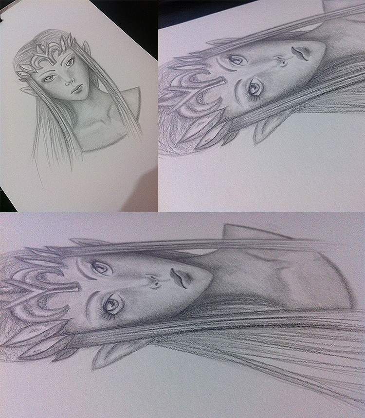
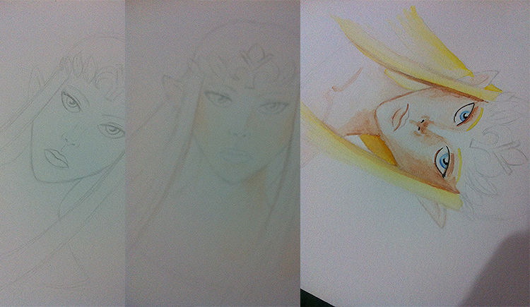
Before doing the watercolor painting, I decided to make a well-crafted sketch in light and shade. I used one as a reference Art of Zelda from the game Twilight Princess (one of my favorite games in the franchise). I designed her so that people could remember her (some details like her small chin, her eyes a bit inspired by manga, the serious face of what she really looks like in Twilight Princess, etc.), at the same time I created something in my drawing style.
Some more photos of the drawing for you to see the details. Tip: I like to create the shadows and then use the shade to blend them and make them more uniform to give this result. Always remember to mark well the places where they will be lighter or darker, and invest carefully in the fading so as not to abuse it and end up leaving the drawing looking “blurry”. That's why I always say in the posts that it's good to learn well how to make light and shade and then play with the fume, hehe.
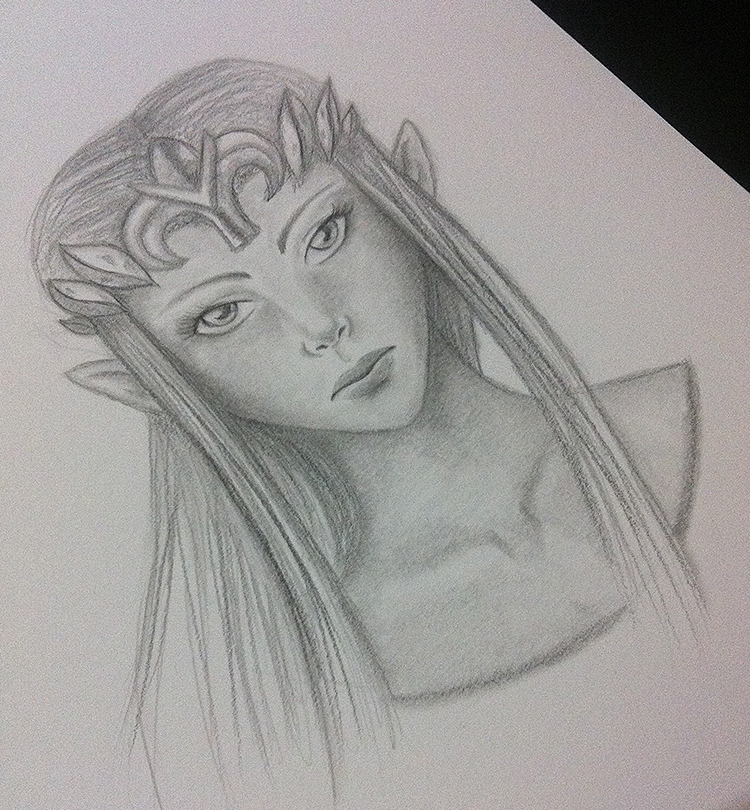
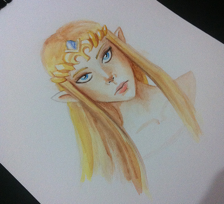
The finished drawing.
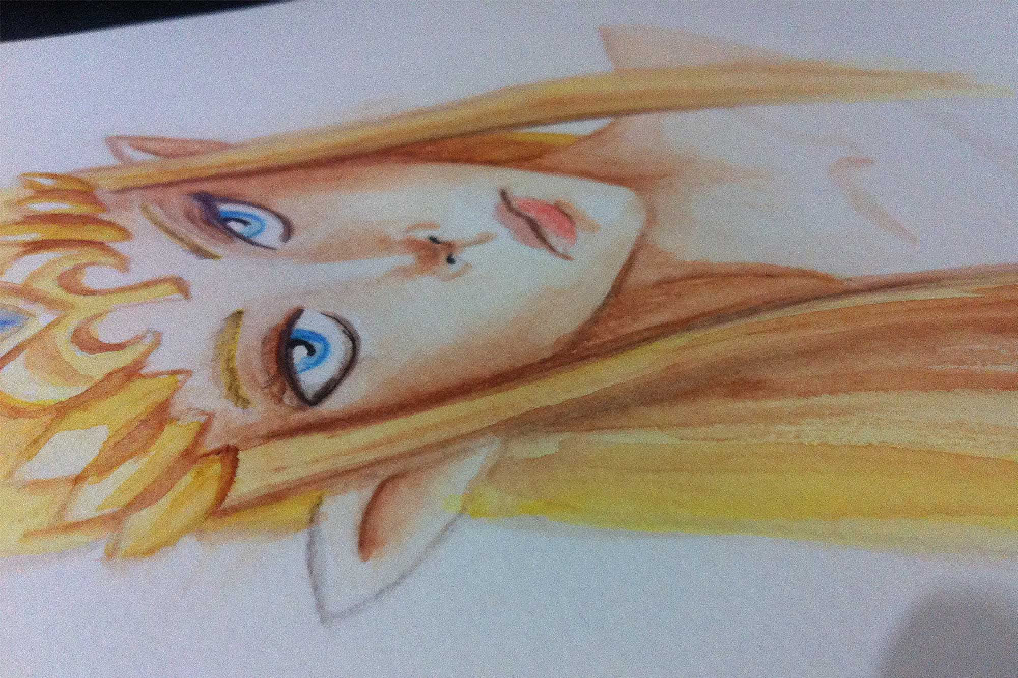
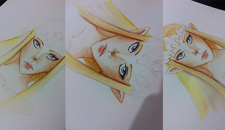
As I did with that other illustration that I posted last week, I remade the drawing from scratch — something that's not so simple to do, because it's almost impossible to leave 100% the same, haha (that's why many — or almost all, haha — decal their drawings using a light board, which I don't have yet, before making a painting). In my case, it's worth redoing, not least because if I want to be a concept artist, I'll eventually have to be forced to make/redo a character, an environment... that kind of thing, and nothing better than training this in a traditional way first to get used to it, haha. So, for this painting, I decided to use watercolor pencils (Faber Castell, the kind you buy at any stationery store) and my case of watercolor tablets from the Van Gogh brand as well. I started by creating a “base” of the skin (a slightly pinkish tone, as you can see in the image), and then brushing it over with watercolor in the places where I wanted to create volume. I regretted, however, thinking that it might be interesting to outline the eyes and nostrils with ink... I think that if I had used dark brown pencils, it would have looked better, but at least I was able to make sure that these details didn't disturb the rest of the illustration as a whole. I outlined the eyes with dark brown pencils and made a slightly stronger shadow on the nose (maybe a little too much, I confess, hahaha, but it was still interesting).
For the shadows, I used brown tones and mixed them a bit with pink (in this I varied between colored pencils and watercolor — for the initial pink I used colored pencils). I used yellow as a base for her hair, although her hair is darker in this game than in the others, but I only used it as a base and mixed it with brown as well. On the eyes, I used light and dark blue pencils. The mouth color is a very “watery” red. With each strong stroke, a napkin was lightly brushed over the top so as not to get too strong and give that effect. And always using brown for the darkest areas, keeping the color pattern I used and staying harmonious.
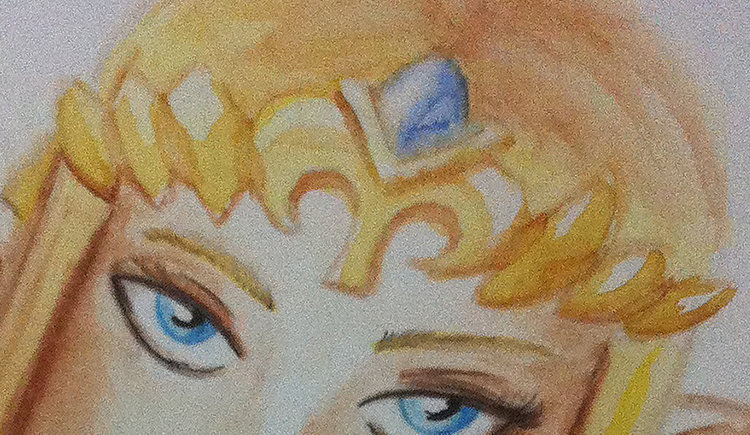
Yellowish and brown tones on the crown and a blue on the jewel. In fact, in blue I also used the napkin to create this effect (which I explained in the image above) and also in Last week's post).
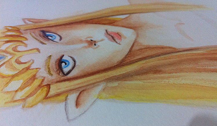
Finished painting.
Despite one mistake or another, I was very happy with the result and I hope to improve even more in my next paintings! And I hope you enjoyed the post! May the tips here, not only in this post, but also in the others, help and inspire you!