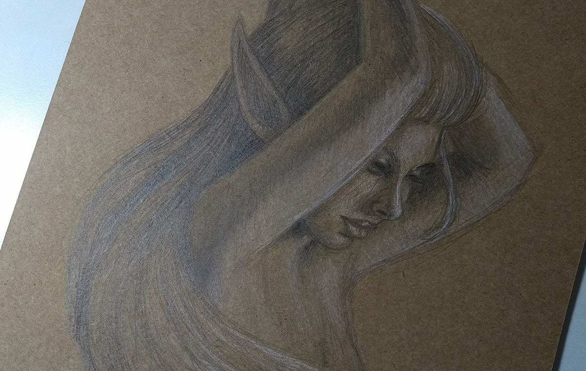
This week I played more with ink and pastel pencils, as usual, haha, but I also did a really cool pose study on graphite and white pastel pencils. Check it out below:
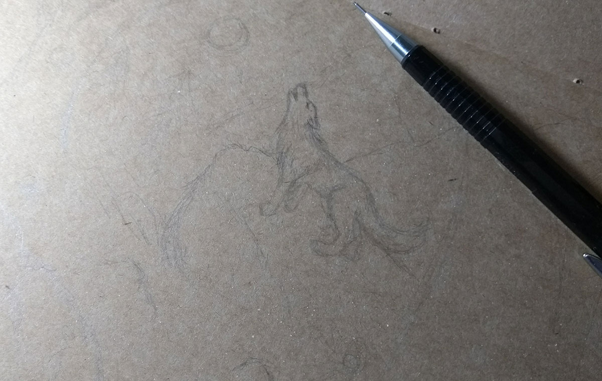
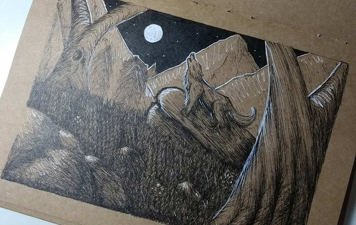
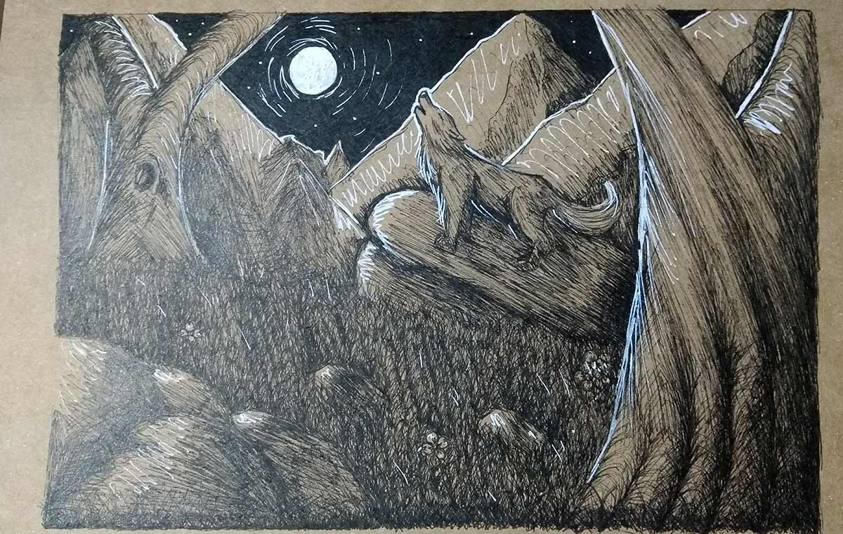
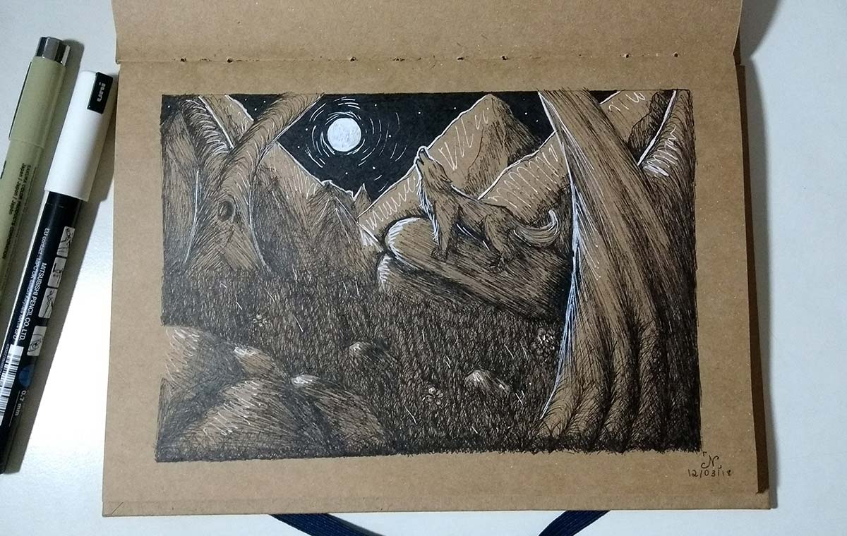
First sketch of the week in the sketchbook. The idea is of a wolf in the forest, howling at the moon.
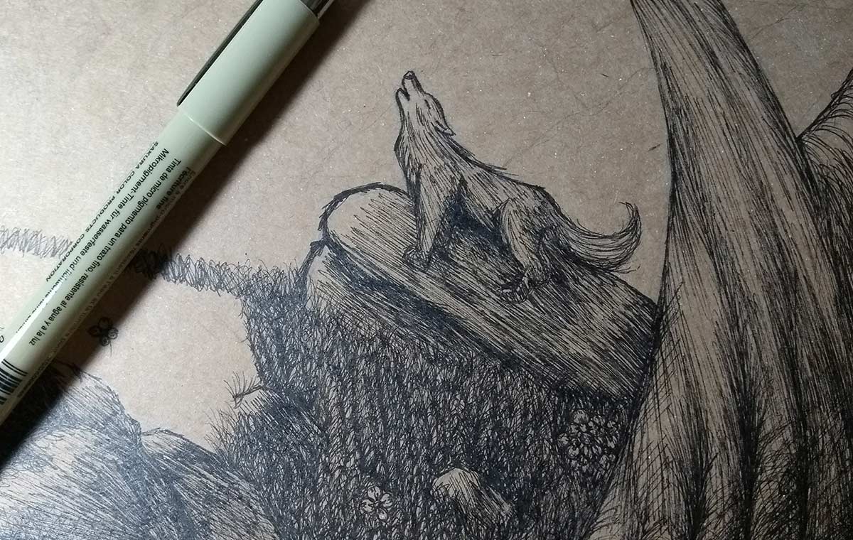
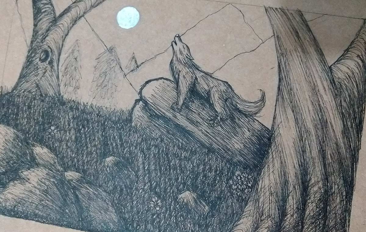
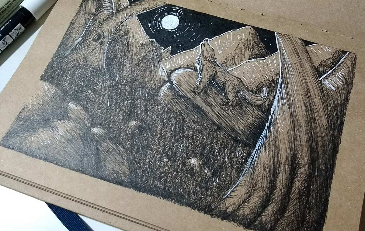
I love doing this type of drawing even as a patience workout, haha. There are many elements, small lines, hatches, to form the details. It's laborious, but it's worth it.
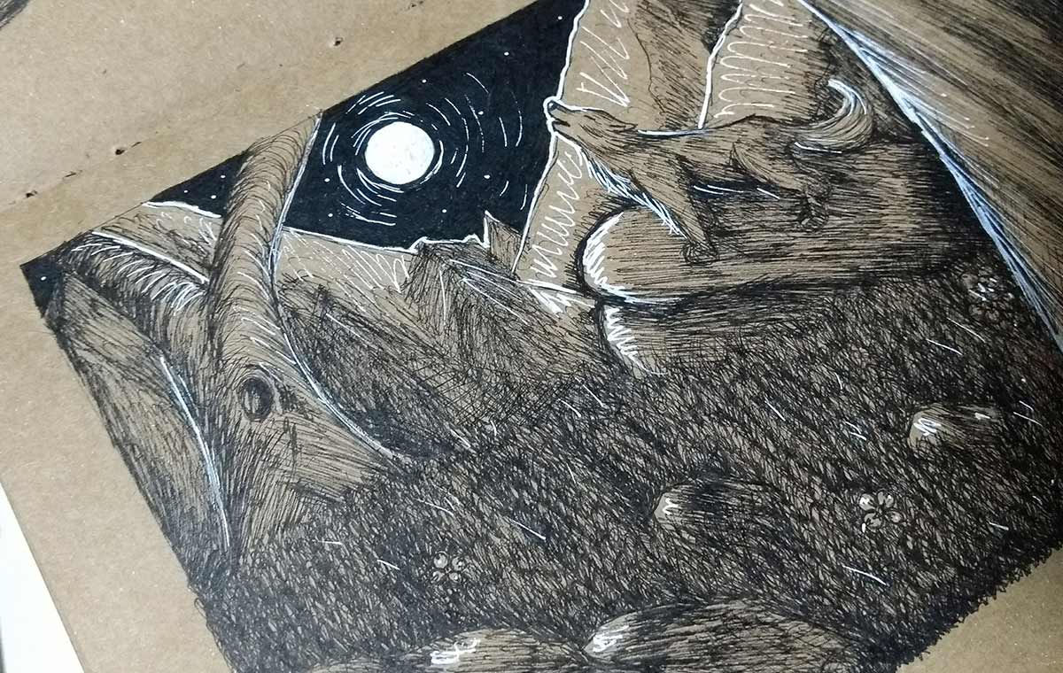
I made the moon all white to generate a strong lighting effect.
Then I made a black background to reinforce the brightness, in addition to the white lighting surrounding the elements as usual.
To further reinforce the brightness of the moon, I made some contour lines on it. It creates a very interesting effect.
Finished drawing:)
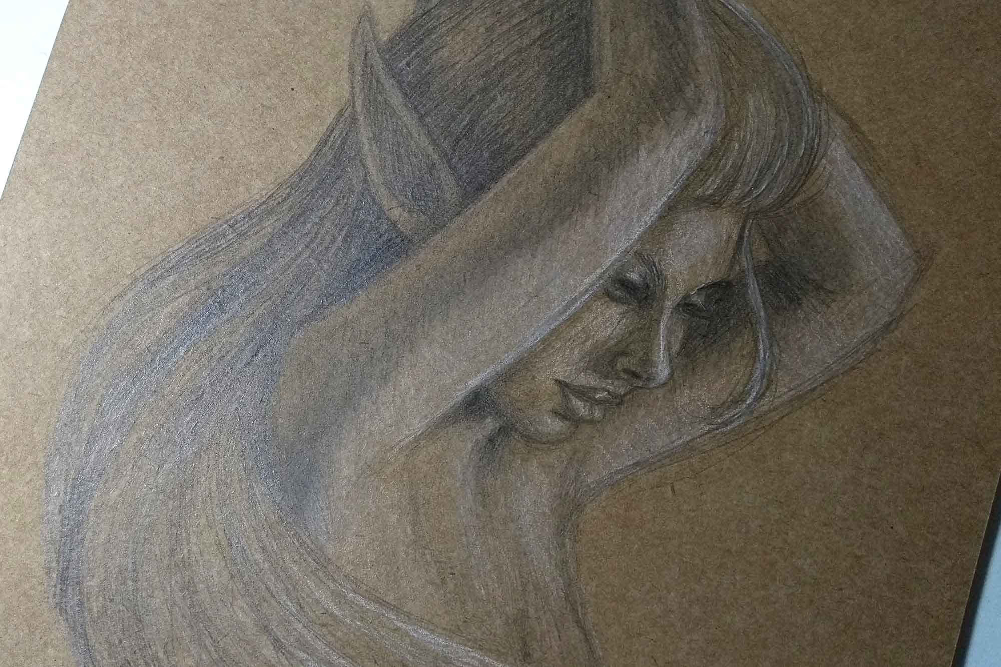
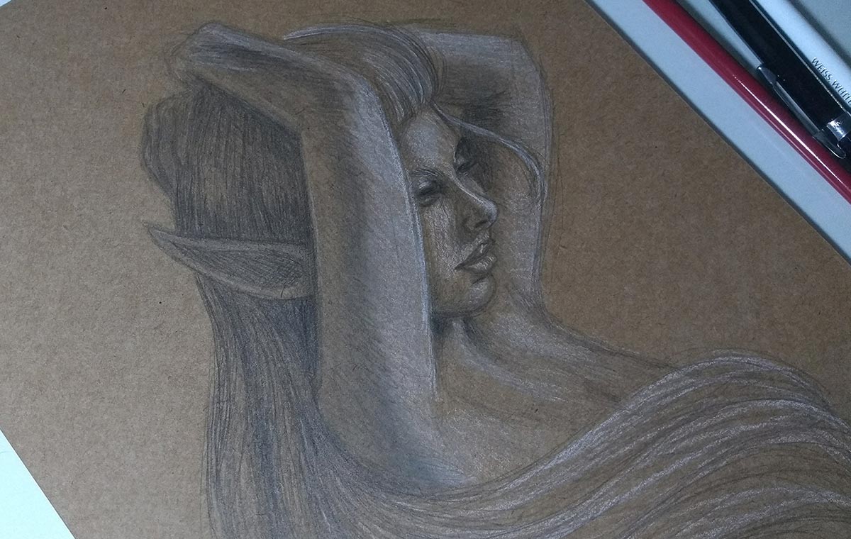
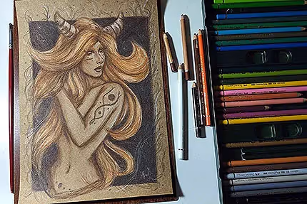
Initial sketch of the pose study. I generally start by studying the reference, making circles, squares... simple shaped elements that I gradually cut until I arrive at the final sketch.
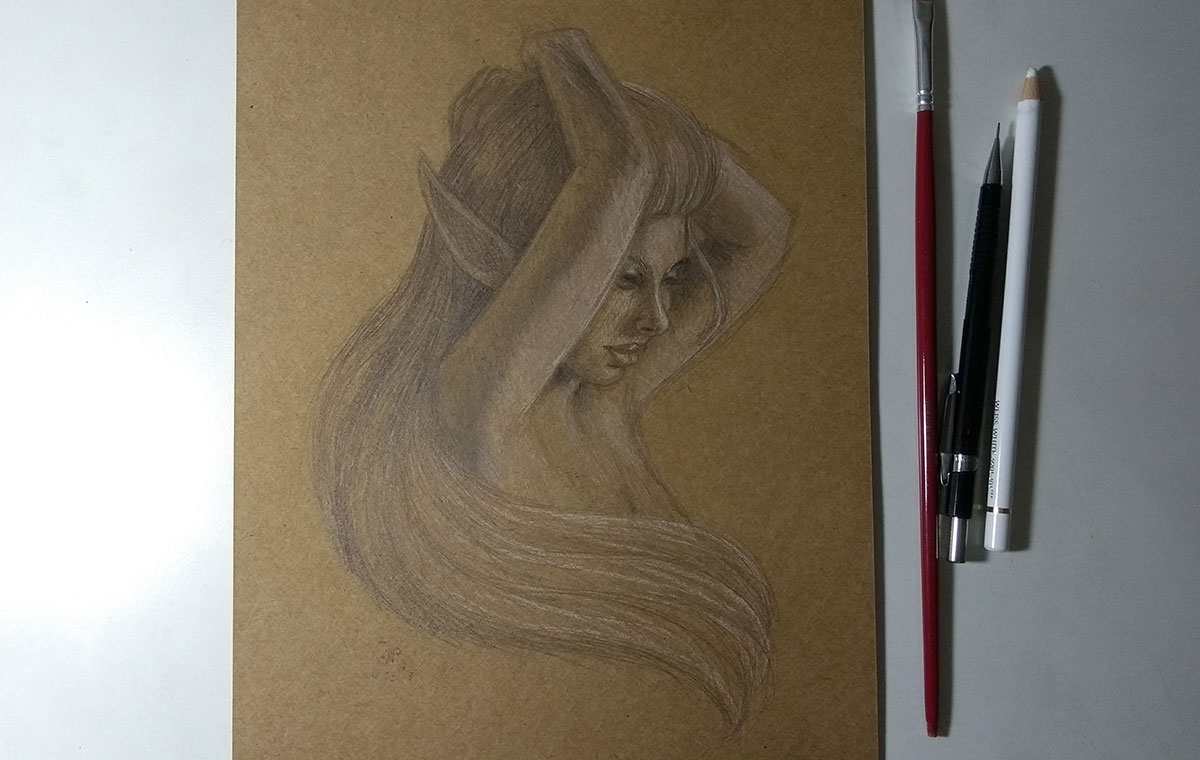
Finished drawing. I used white pastel pencils for the light and only the mechanical pencil to create the shadows. In some areas I left it unpainted to create a diffused light effect, which makes the design more natural (you can clearly see this in her arms: diffused light, shadow, direct light - in that order). In addition, I use my workaround (that brush in the photo, which I comment more about In this post) to merge colors. Sometimes I don't even blend, haha, but when I want to create a softer effect, as in this case, I like to blend.
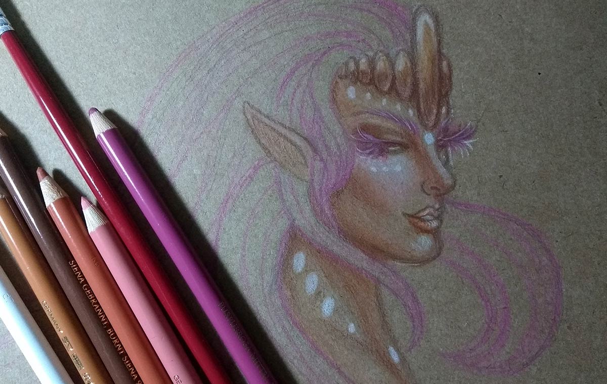
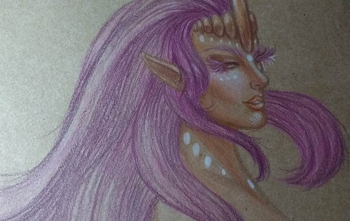
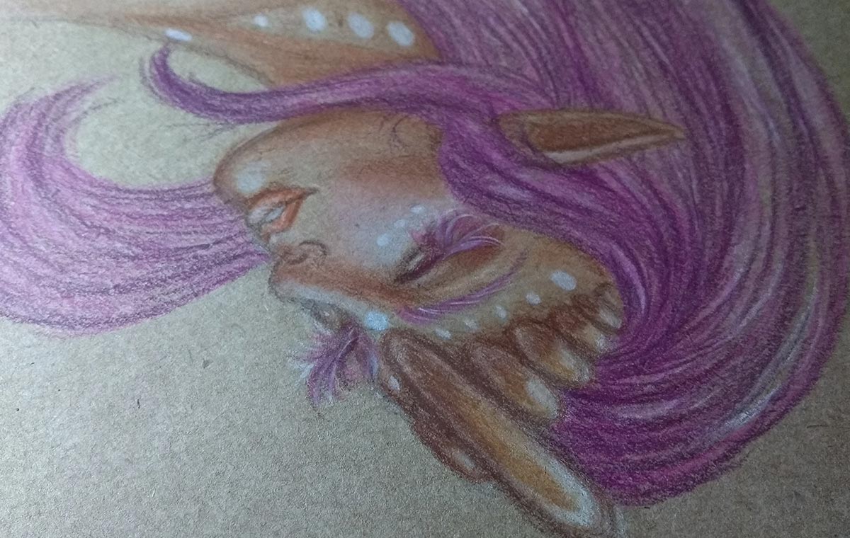
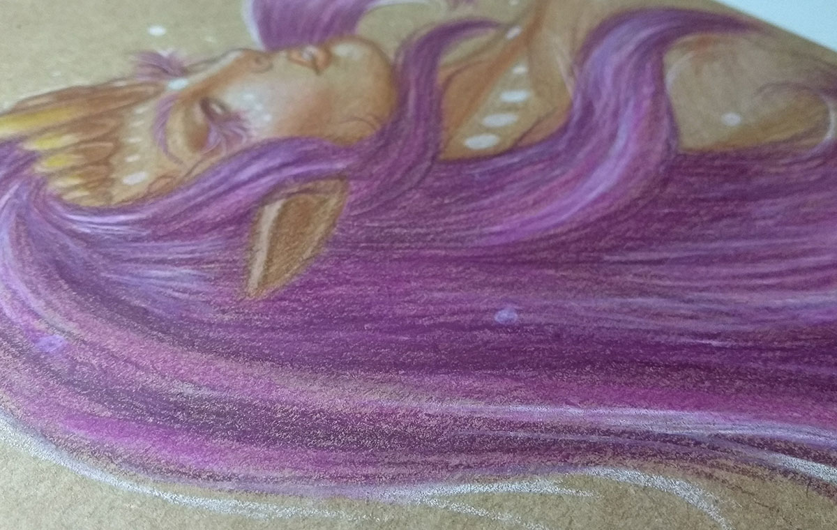
An unreferenced doodle to warm up.
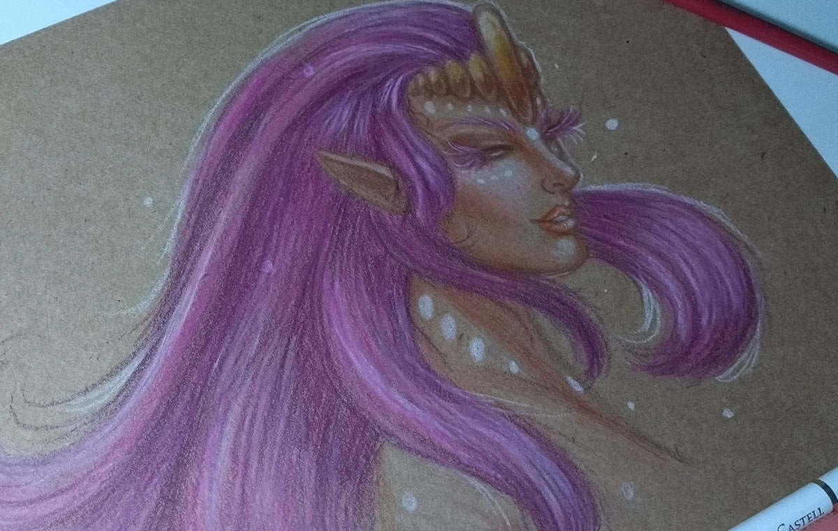
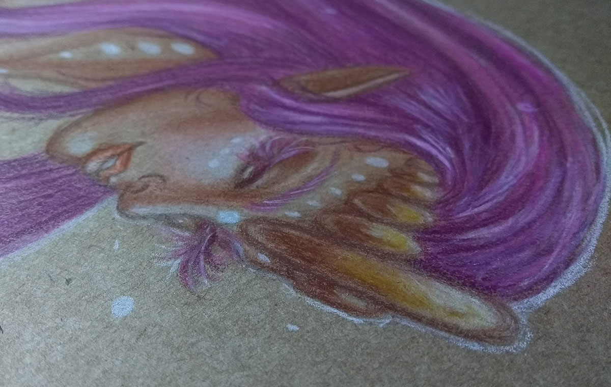
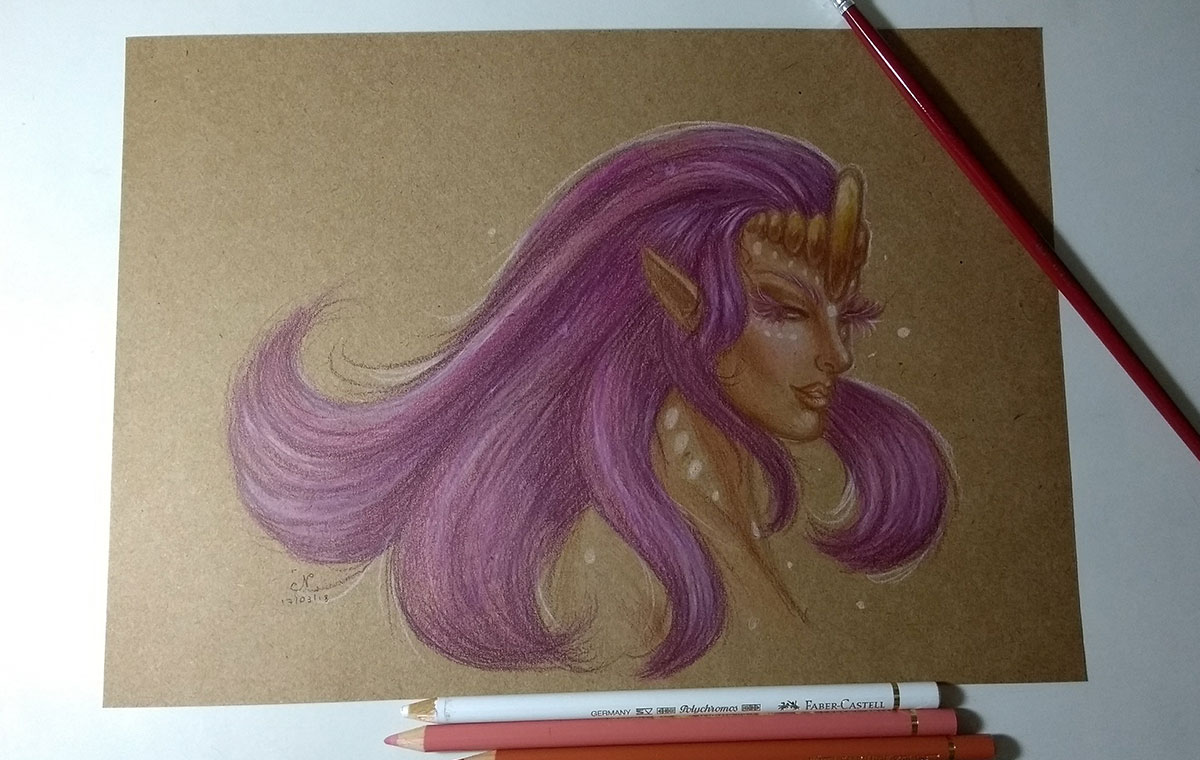
The cool thing about working with pastel pencils (and especially those Faber-Castell professionals, the Polychromos) is that you can use multiple layers of color to generate contrast. I always tend to create a light base, with soft tones that I gradually lighten or darken, depending on what I want to do. Because of this, I use white pastel pencils a lot, it helps a lot to lighten tones.
Sometimes I even do some darker and semi-dark layers on purpose and apply the white pencil over the top to lighten some tones. It gives a very nice glow effect.
For gold elements, as I have mentioned in other posts, I like to use brown and yellow, in addition to light yellow and white for the light.
Finished drawing.
And for today it's just personal. I hope you enjoyed it and that the tips helped you in some way:)