And here we go to the 61st edition of the Drawings of the Week! It yielded several digital doodles, it was very good. I'm happy to finally be feeling more comfortable working with digital art. In the past, between 2013 and 2015, I already liked to do digital arts, but I still experienced that difficulty in the transition between traditional/digital. I realize today that it was more due to a lack of trust in my drawings than something more “profound”.
Now that I finally have a style of my own, I feel like everything has become easier. When we find our own identity in art, everything flows better, without a doubt. It takes time, of course. It takes a lot of time, but it's definitely worth it.
A tip that I'll give you, by the way: Invest plenty of time in traditional art, learning the basics of drawing itself before venturing into digital art - unless, of course, you've already started digital and are already familiar with it, haha. I've seen some artists who started digital and then practice more traditionally. The truth is that there is no such thing as a 100% right path. It all depends on the artist himself, willpower, practice... little by little you find your own path on the journey.
In addition to the doodles, you may have noticed that I edited some elements on the site. I always do that, sometimes it's subtle, sometimes more evident. This time I changed several things, such as some fonts, styles of Hover, background images... I fixed some bugs too, normal (it's no use, it's like an app: from time to time you have to give that “general” check to improve or update the experience, haha).
I can't help it.
I went to sleep about 5 in the morning yesterday/today just editing these things, not to mention the previous days... a bit here and there — yes, I can't help it, I get very carried away... let's just leave it alone :x
Let's get to the drawings! <3
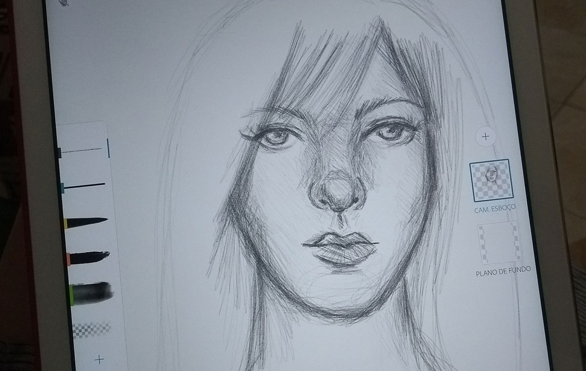
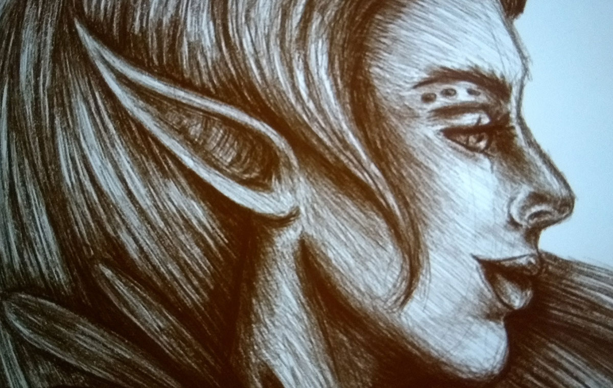
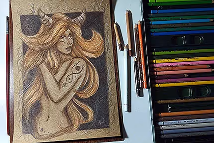
I started the week with this sketch in Adobe Sketch. I confess that I didn't finish, hahaha, so much because I forgot about him because I didn't get so carried away. It happens XD
Scribble on Bamboo Paper — currently my favorite app for doodling! Soon I will review it:)
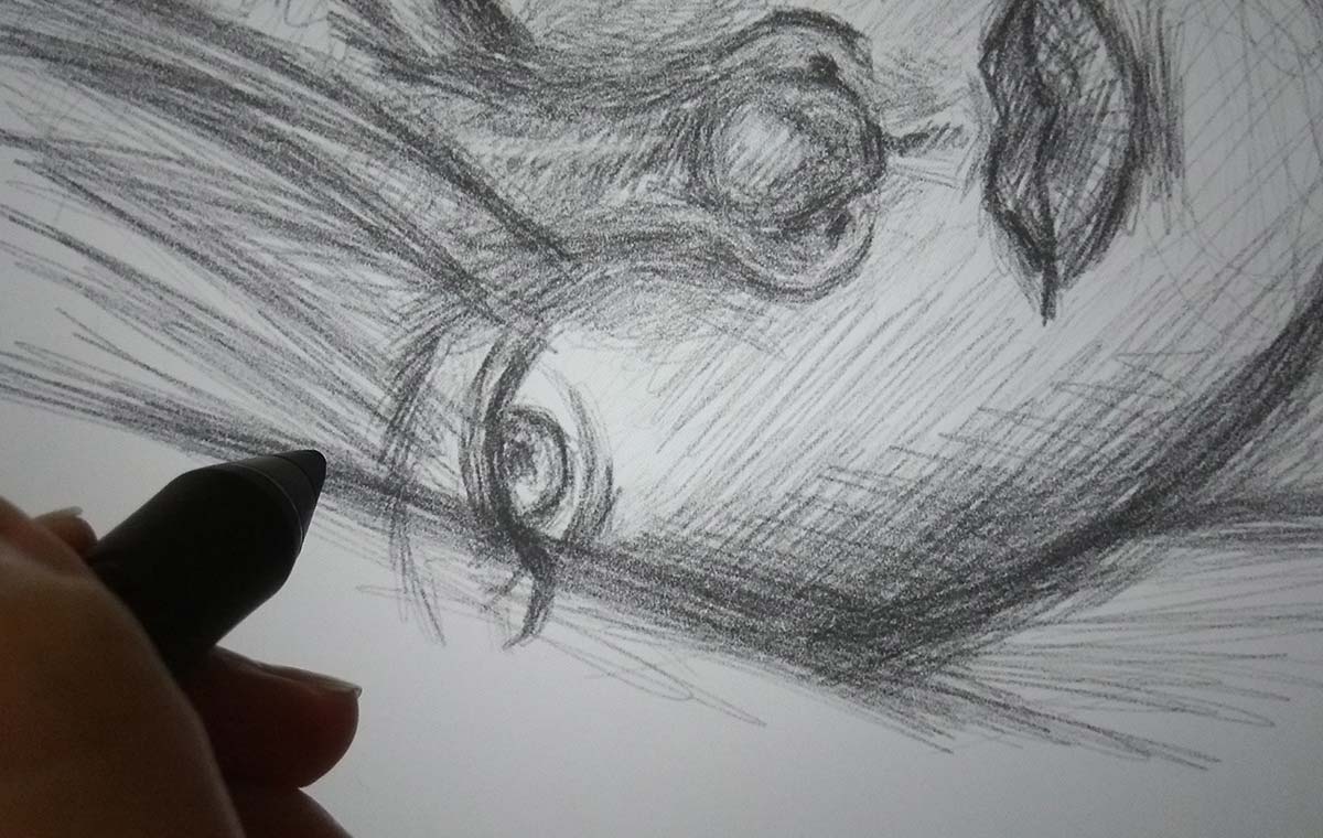
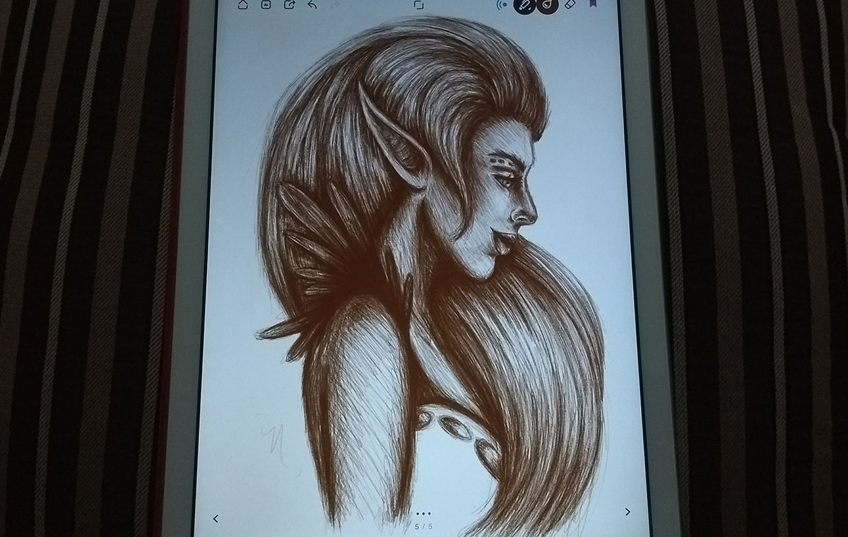
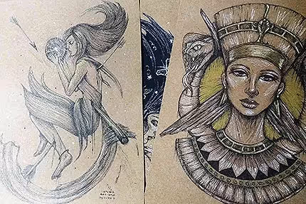
This sketch is one of my favorites of the week:)
I'm really enjoying working with the brush that mimics graphite pencils. The coolest thing is that in a way I end up mixing my two styles (the way I work with ink pens, making messy lines and the way I work with pencils, smoothing out some lines, taking advantage of the stylus's pressure points).
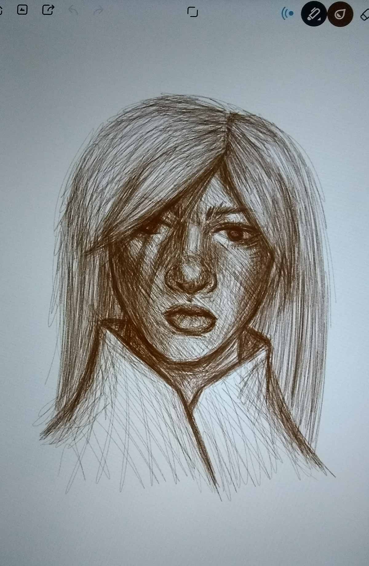
Final design, exported. It's a shame that Bamboo Paper doesn't export in larger sizes, just the maximum screen resolution, from what I noticed. In my case, because I use an iPad Air 1, the maximum is 2048px:/other than that, it doesn't export at more than 72 dpi... but I'll leave it to comment more about those details when I review the app, hehe:)
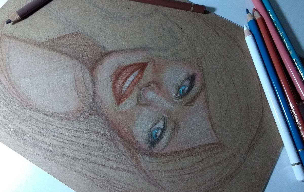
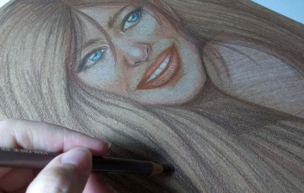
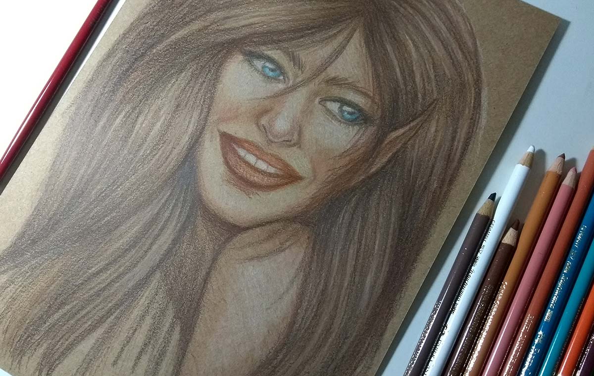
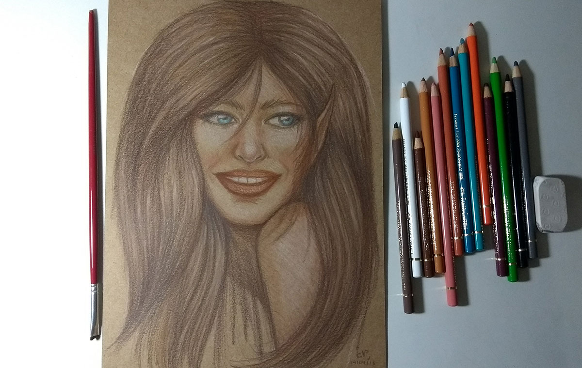
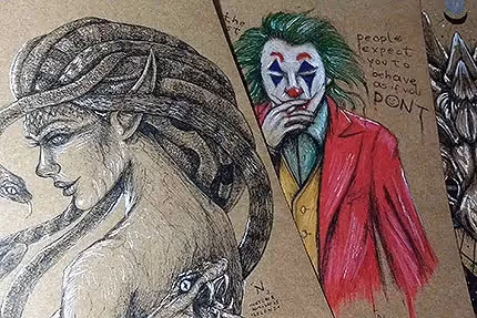
Study of expression in pastel pencils. Since I don't usually draw smiles, I decided to do it this time.
I ended up exaggerating my smile, I think, haha... and I think I left my nose too small... but overall it was cool and made the cartoon more “funny”, which was interesting.
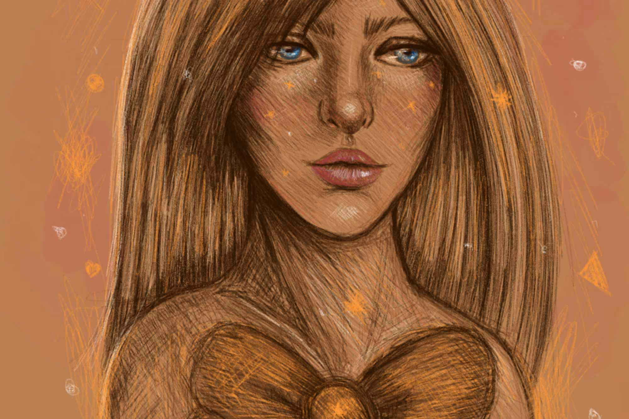
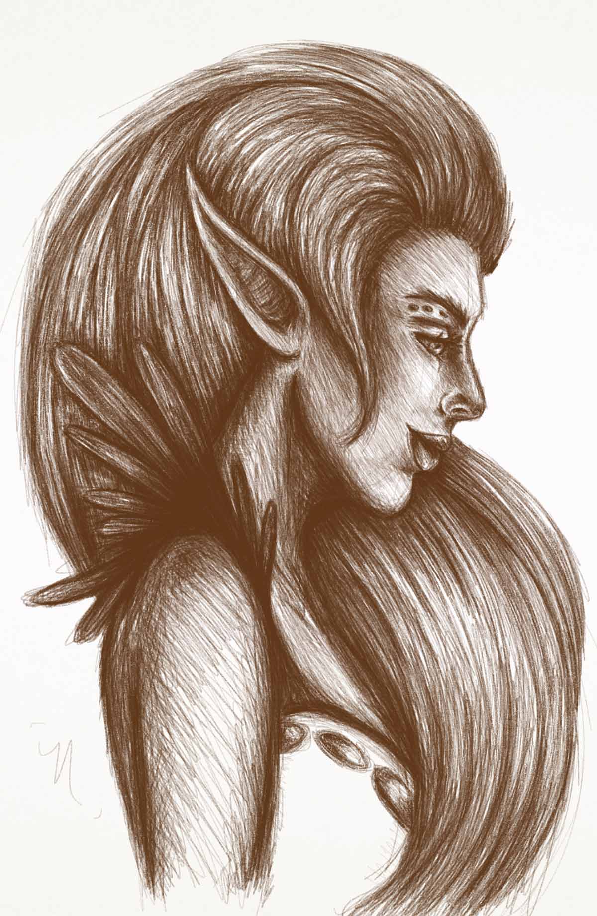
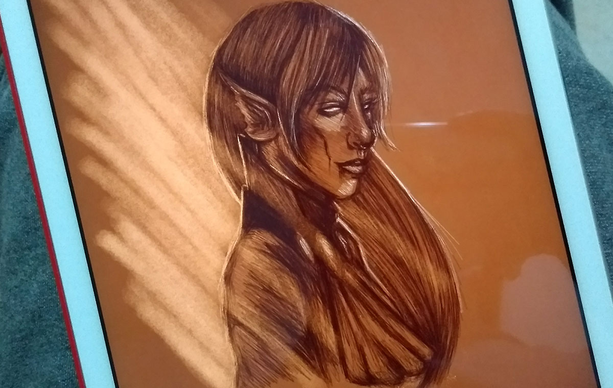
In this digital doodle, I decided to paint a background with a dark color, similar to kraft paper, to test.
I had a lot of fun here, mainly because I was able to play more with the lights. I also used another brush on this one, thicker, to reinforce the lighting on the left side.
Exported design. I really liked the result, but I noticed that the background was much darker than I wanted, hehe. Still, it was fun and had a cool effect. Unfortunately, Bamboo Paper doesn't have as many ways to edit (for example, it doesn't have layers, so you do it all at once). In fact, I even chose to work more with Bamboo Paper because of this. I found it fun to work directly like this, the challenge of not having the option to edit a lot, without worrying about managing layers. Not to mention that since my stylus is from Wacom it has better compatibility with the app, it barely has that much Lag The response time between strokes and palm rejection works almost 100%.
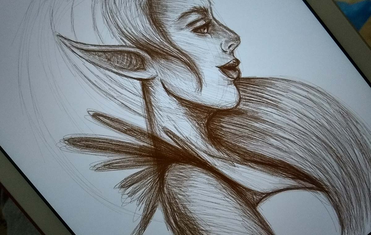
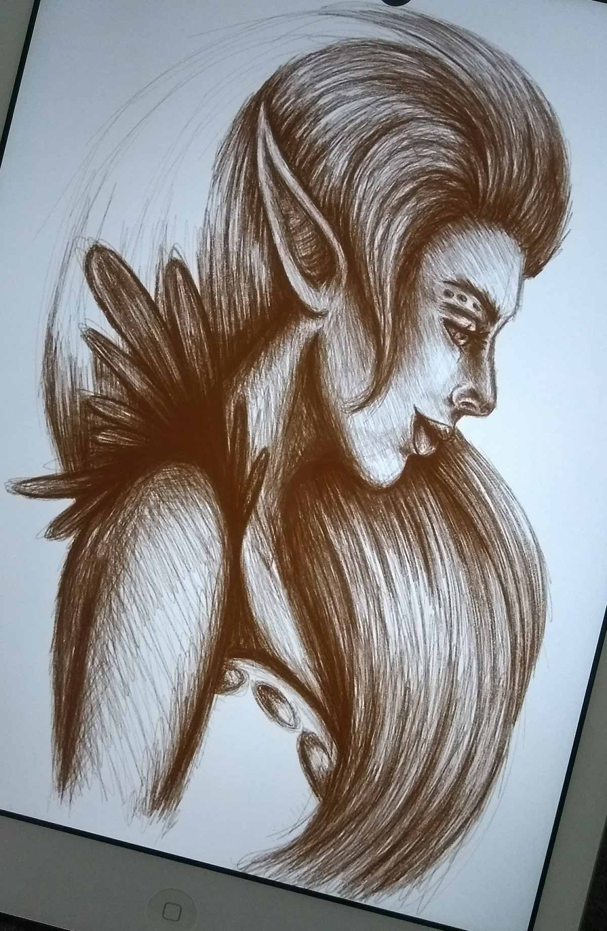
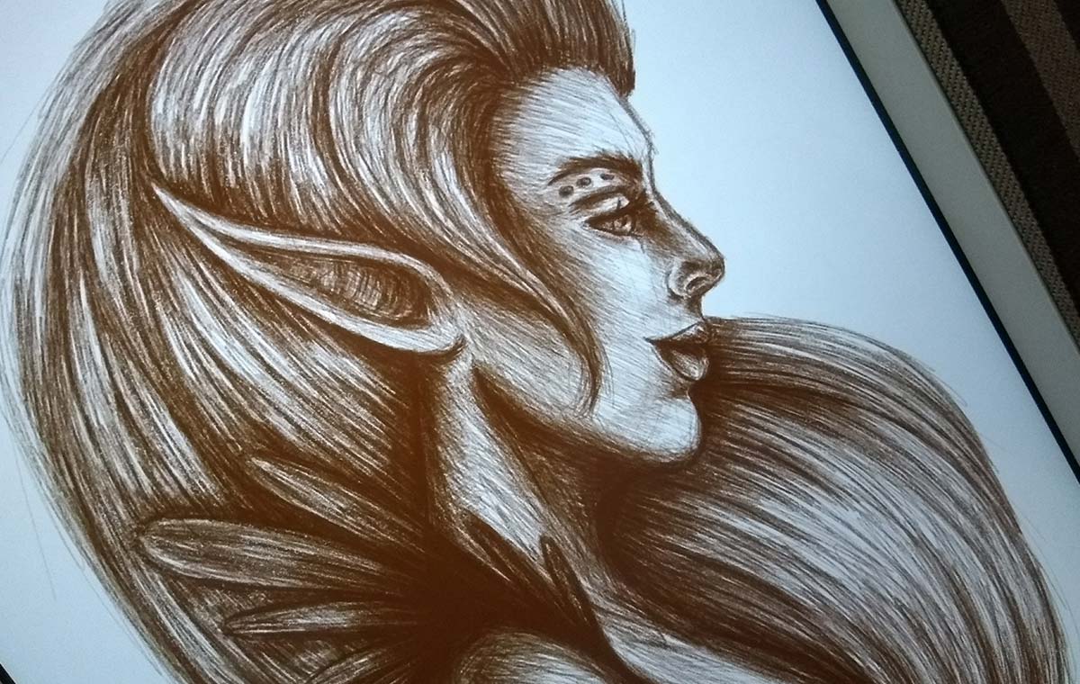
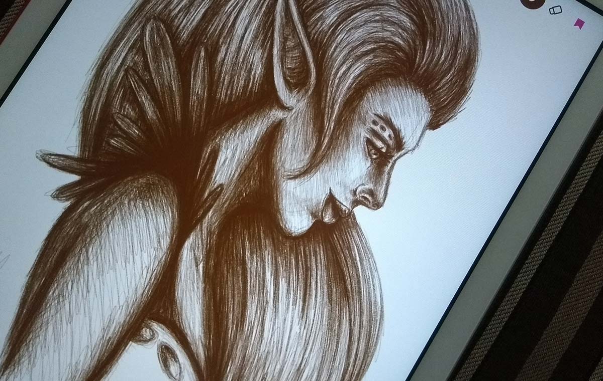
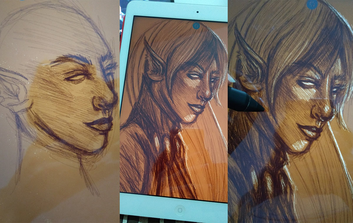
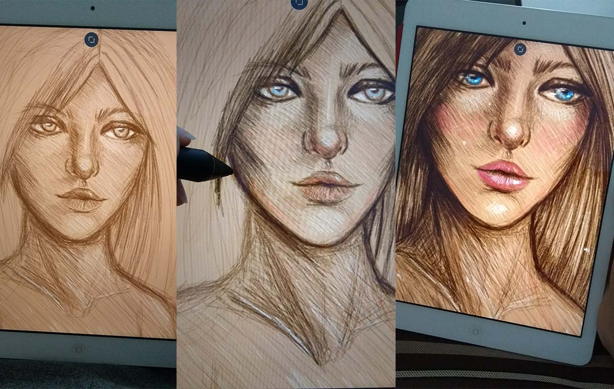
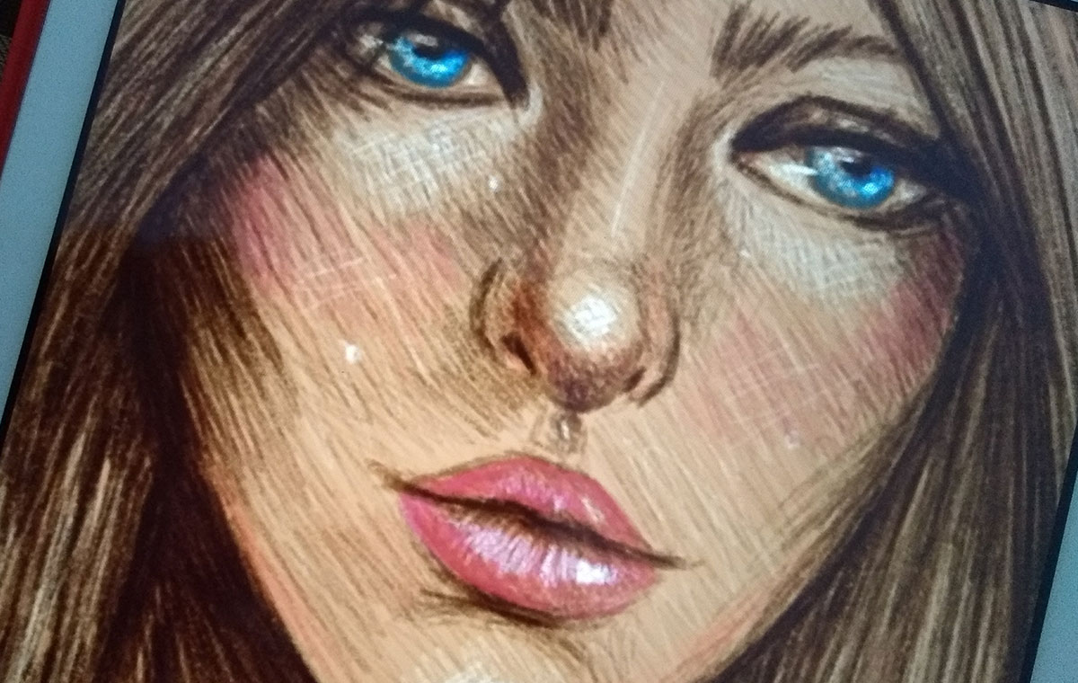
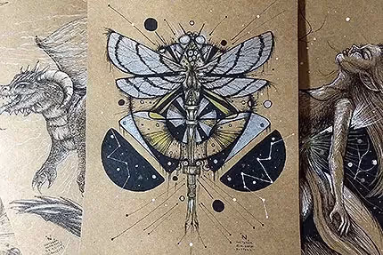
Last but not least (and also one of my favorites), doodle of the week. I put the three photos together for you to see the process a little better.
Exported design. Notice that in this one I decided to make a lighter background and work darker colors on top, but always opting for a medium tone for the background. It helps a lot later to work on light and shade.
And that's it for today, guys! In fact, on Bamboo Paper I'm trying to work on an initial sketch and I'm already painting directly on top, which creates a super cool effect. Basically, as I said in the previous post, I'm trying to recreate the experience of working in the traditional but in the digital one. It's working very well so far:)
NOTE: sorry for the quality of some images. I had to reduce as much as I could to not weigh it down when loading everything (and I like to make them big so you can see the details better, haha).
I hope you enjoyed today's post and the changes to the site! Next week there will be more o/