Apr 29, 2018

First of all, I would like to thank everyone who follows the blog, the Facebook page, Instagram, etc. It's been an incredible journey for me, I've improved so much in recent years... and it's amazing to be able to meet so many friendly people who are inspired by my work and who like to follow up. Really appreciate it, guys :)
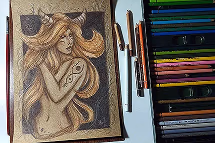
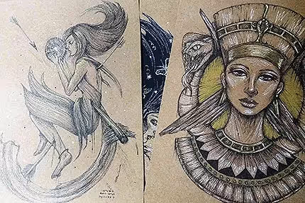
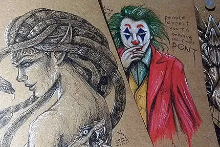
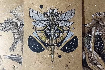
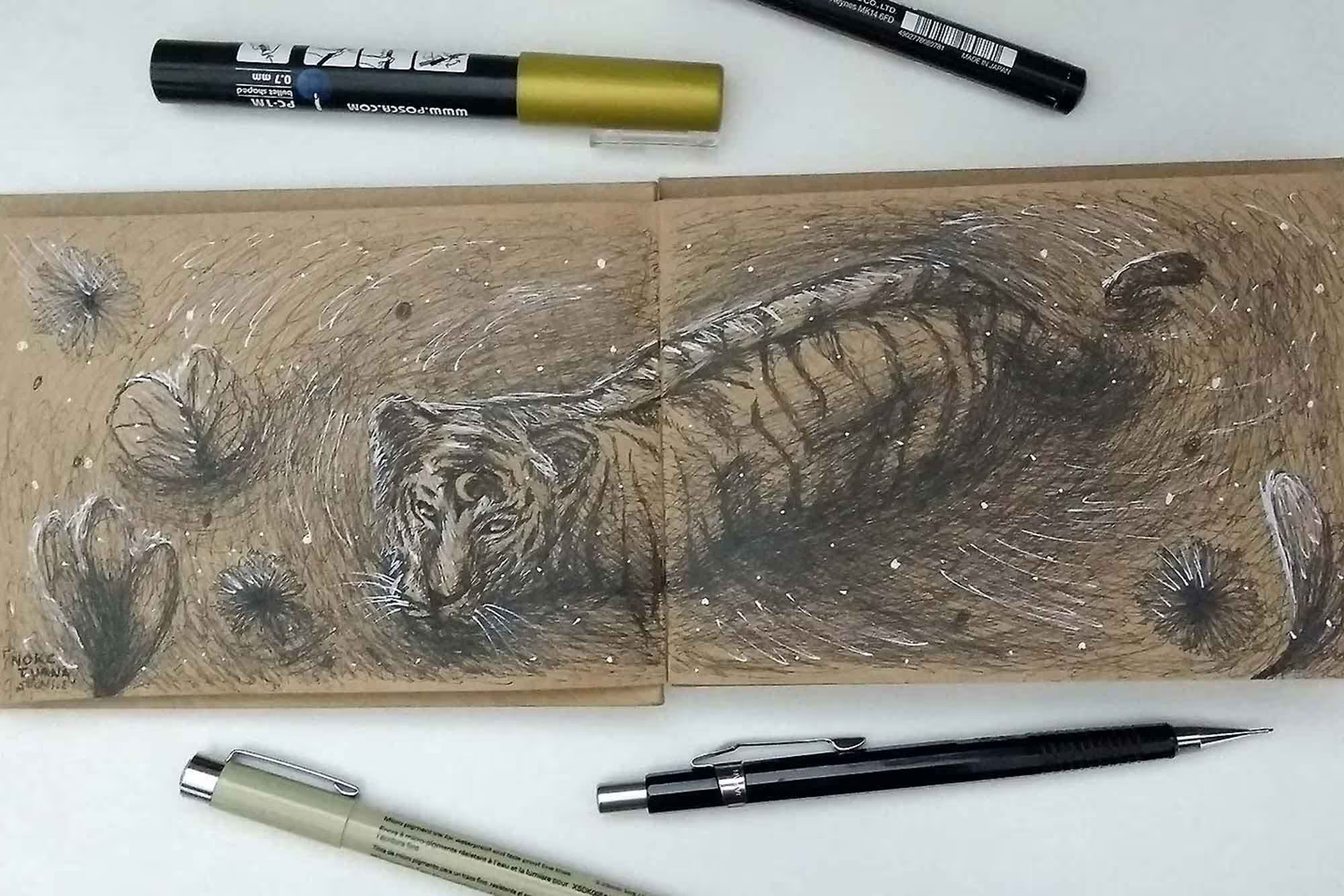
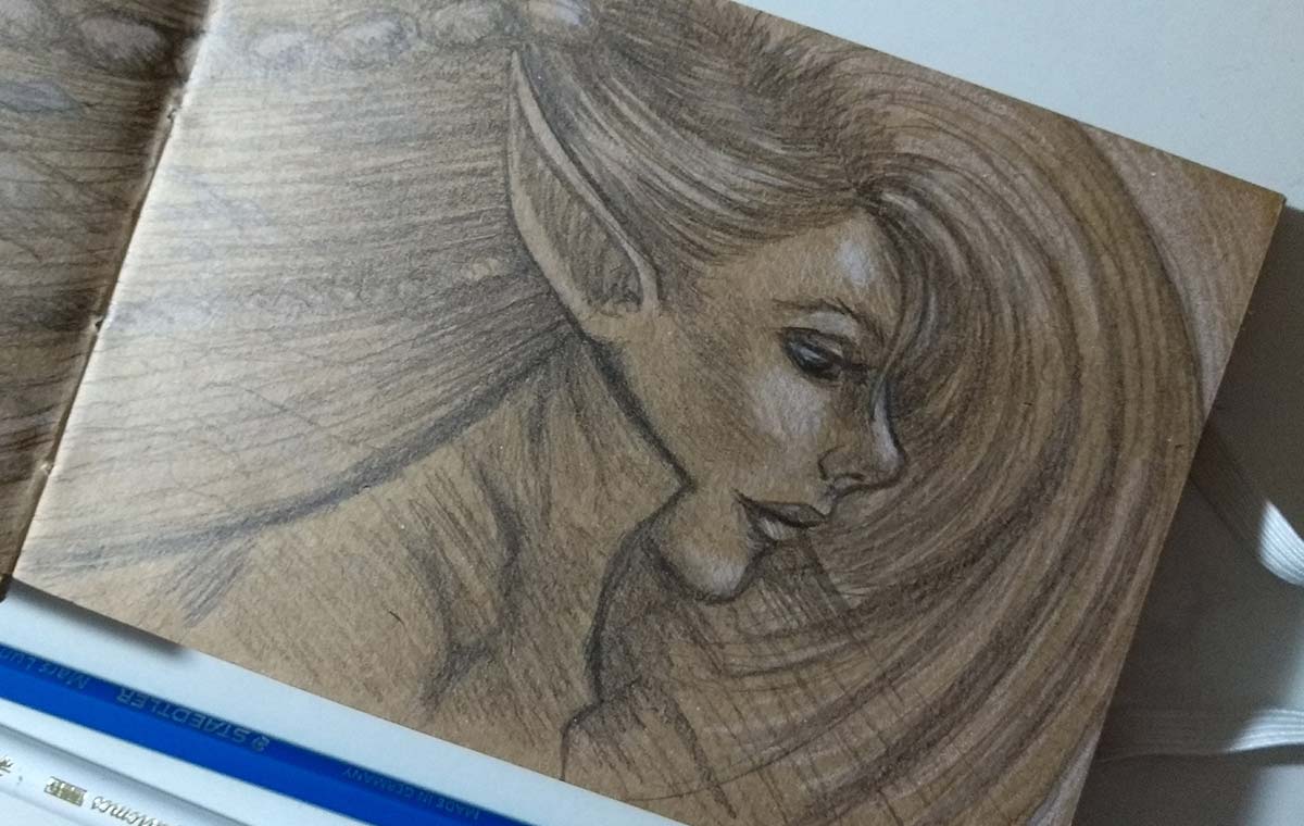
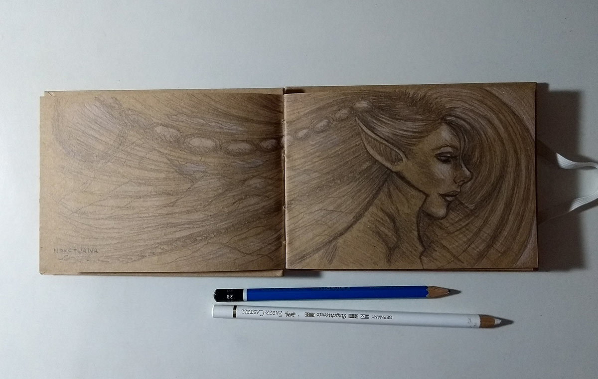
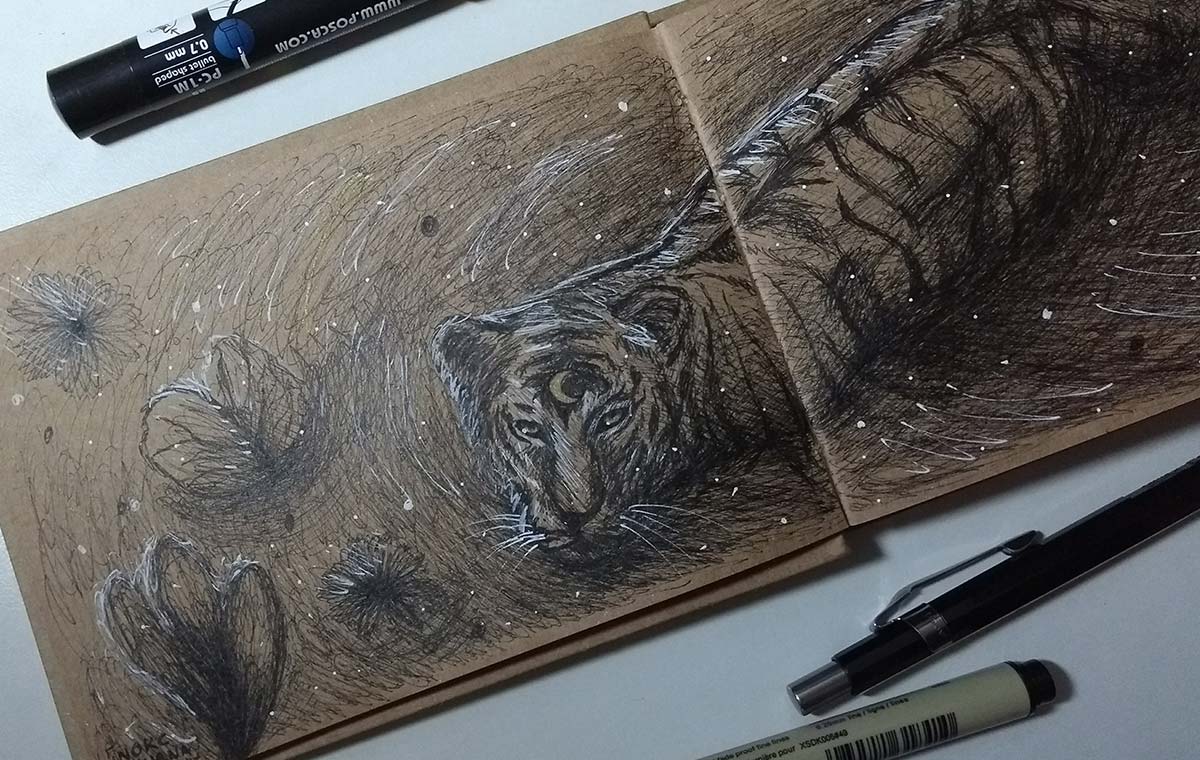
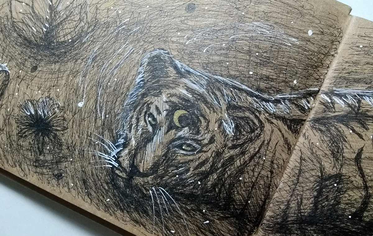
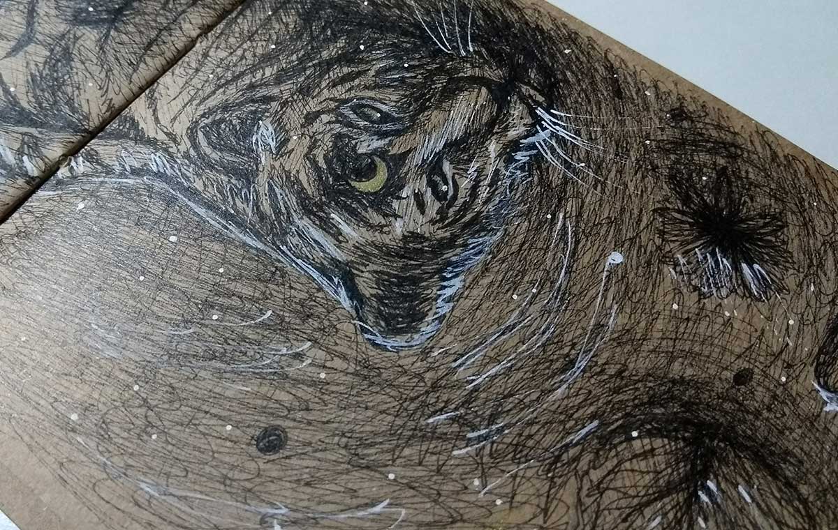
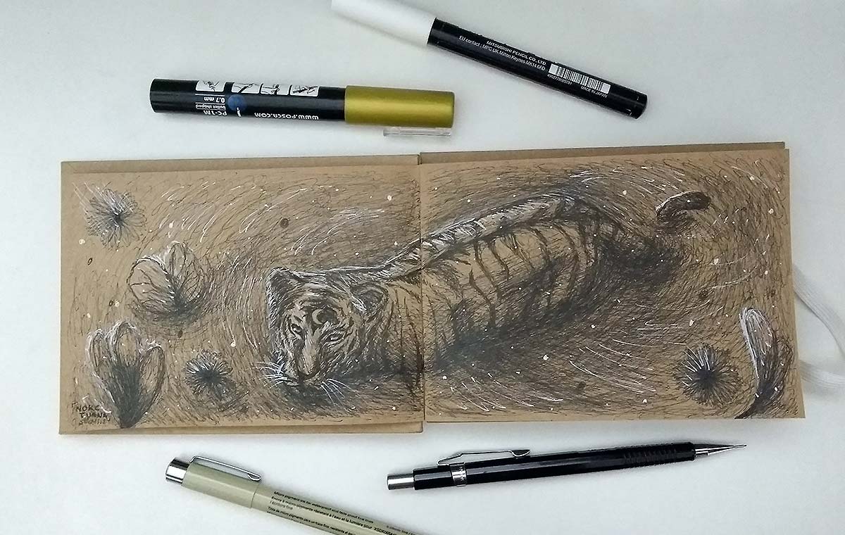
This week I took the opportunity to draw more in the other sketchbook I bought from Miolito, the small one, which I mentioned in a post because I wanted to use it to be a “traveling companion”. The problem is that I don't go out much and when I go out it's such a rush that I don't have that much time to draw, hahaha :( but it was nice to try to create more “complex” drawings in a small sketchbook, haha.
Let's go!
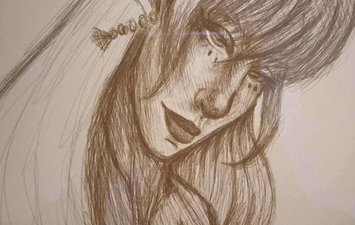


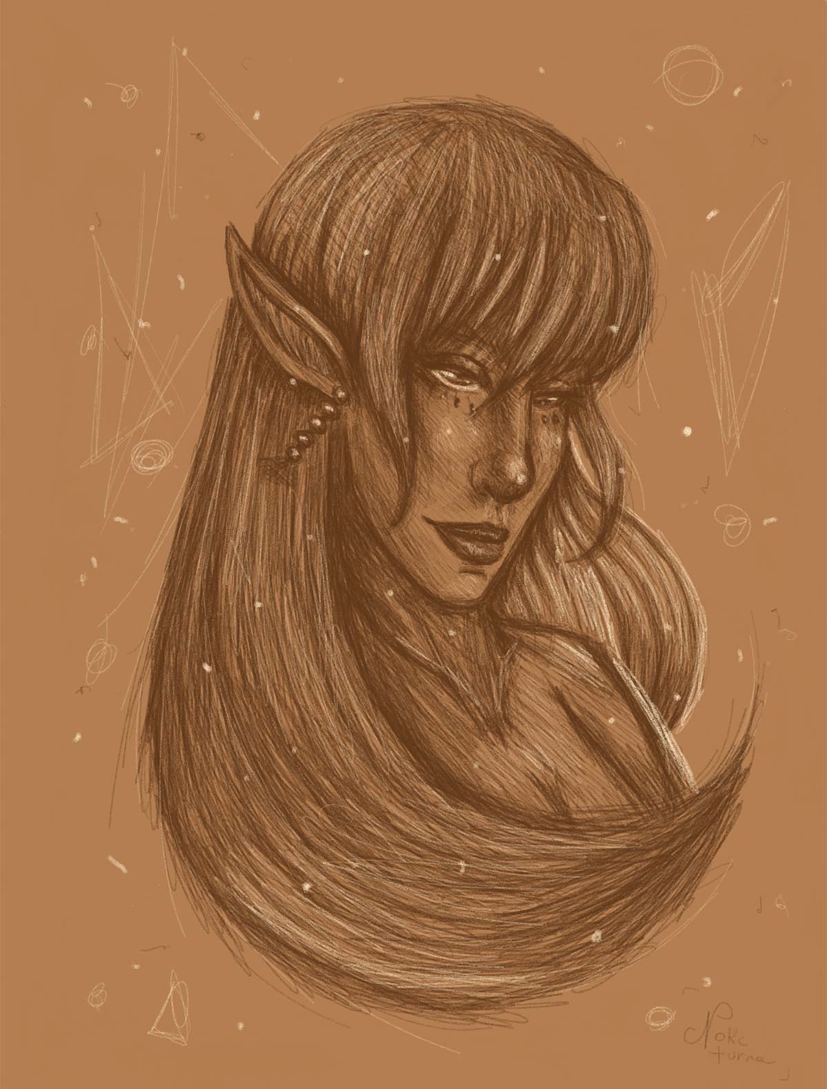


I always advise using references. If you are new to drawing, I highly recommend trying to copy photos at the beginning. It helps to understand how light and shadow work and also helps to train the design of that specific object, person, animal, etc. By making several, over time you can create something of your own without reference even. In my case today I use reference only as a basis for something that I never designed or something that I need to practice and that I then insert into my own universe, in a style that I create myself. That takes time, you know, so you have to be patient and practice a lot:)
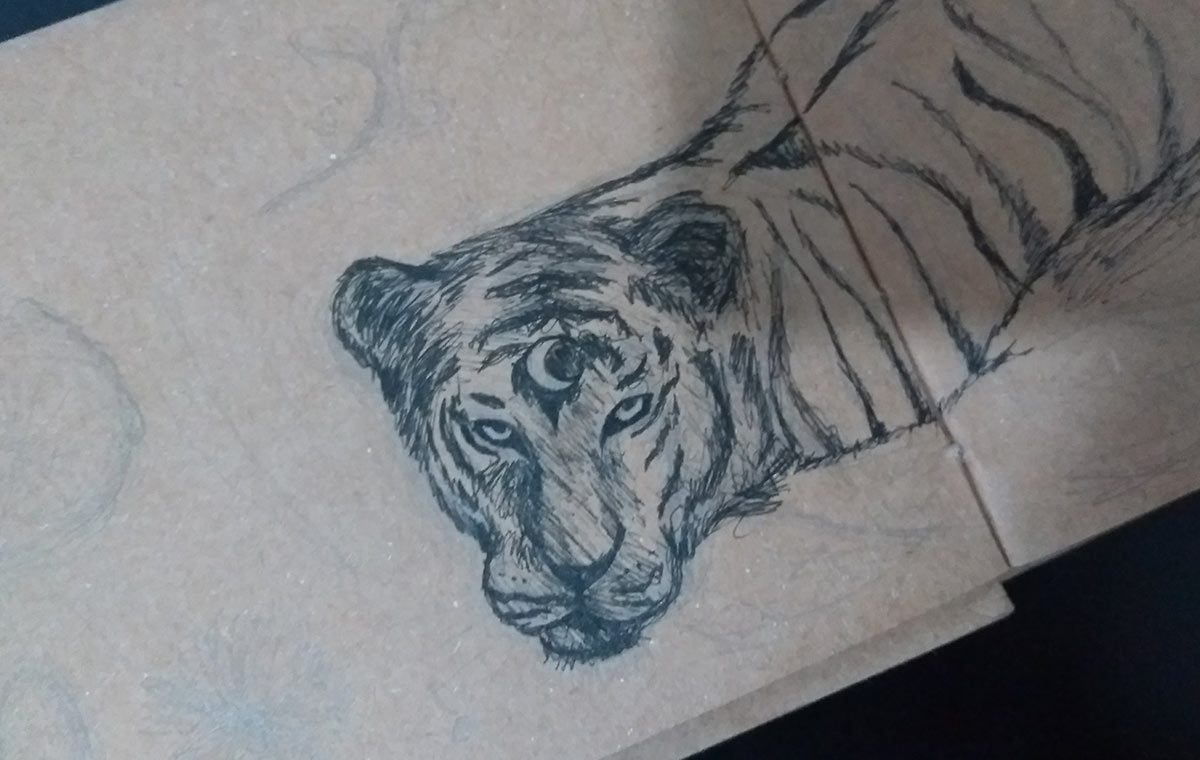
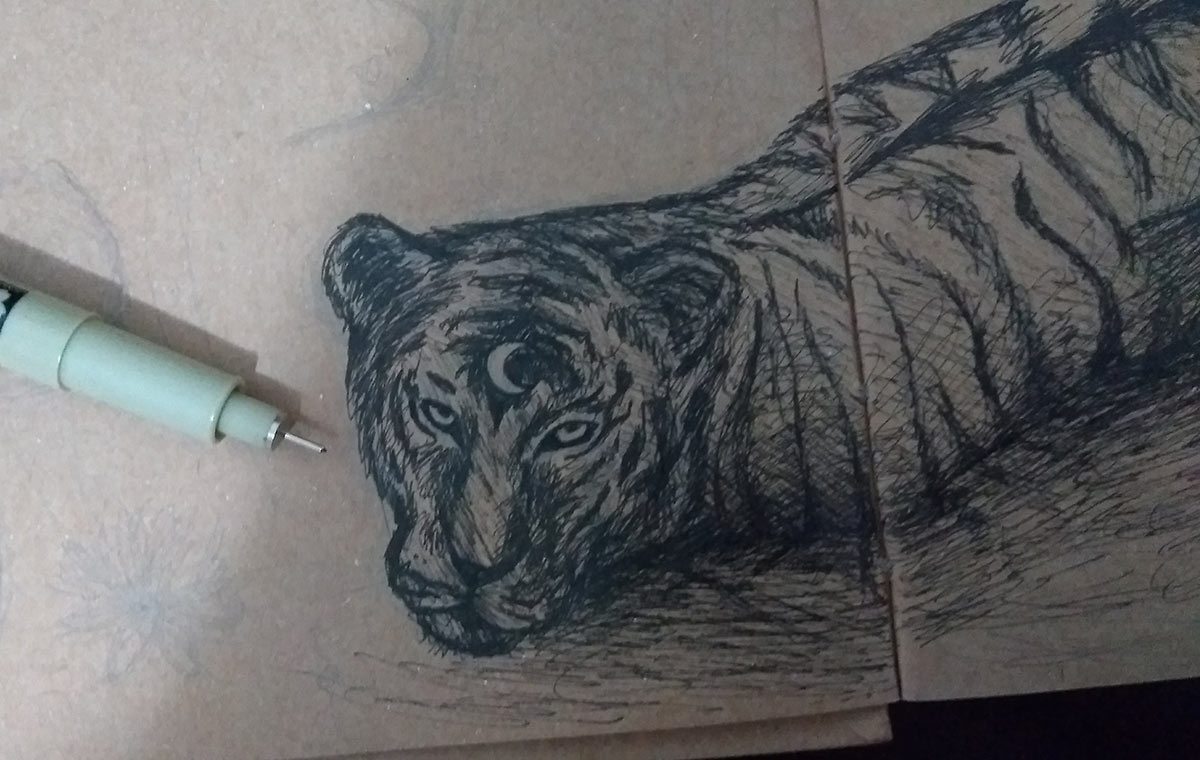
Discovering your style isn't easy at all. I spent years searching for mine myself - as you can see here in older posts. I have already gone through digital, graphite, colored pencils, pastel pencils, ink, watercolor... and in the end, when I identified myself with the type of material I would like to use, it was in ink and pastel pencils on kraft paper, in addition to digital, of course, that my messy lines took shape.
Don't give up. Following the path isn't easy, I know... but it's so worth it! :)
NOTE: something new: I created a Tumblr, haha! If you want to follow the link here: https://nokcturna.tumblr.com
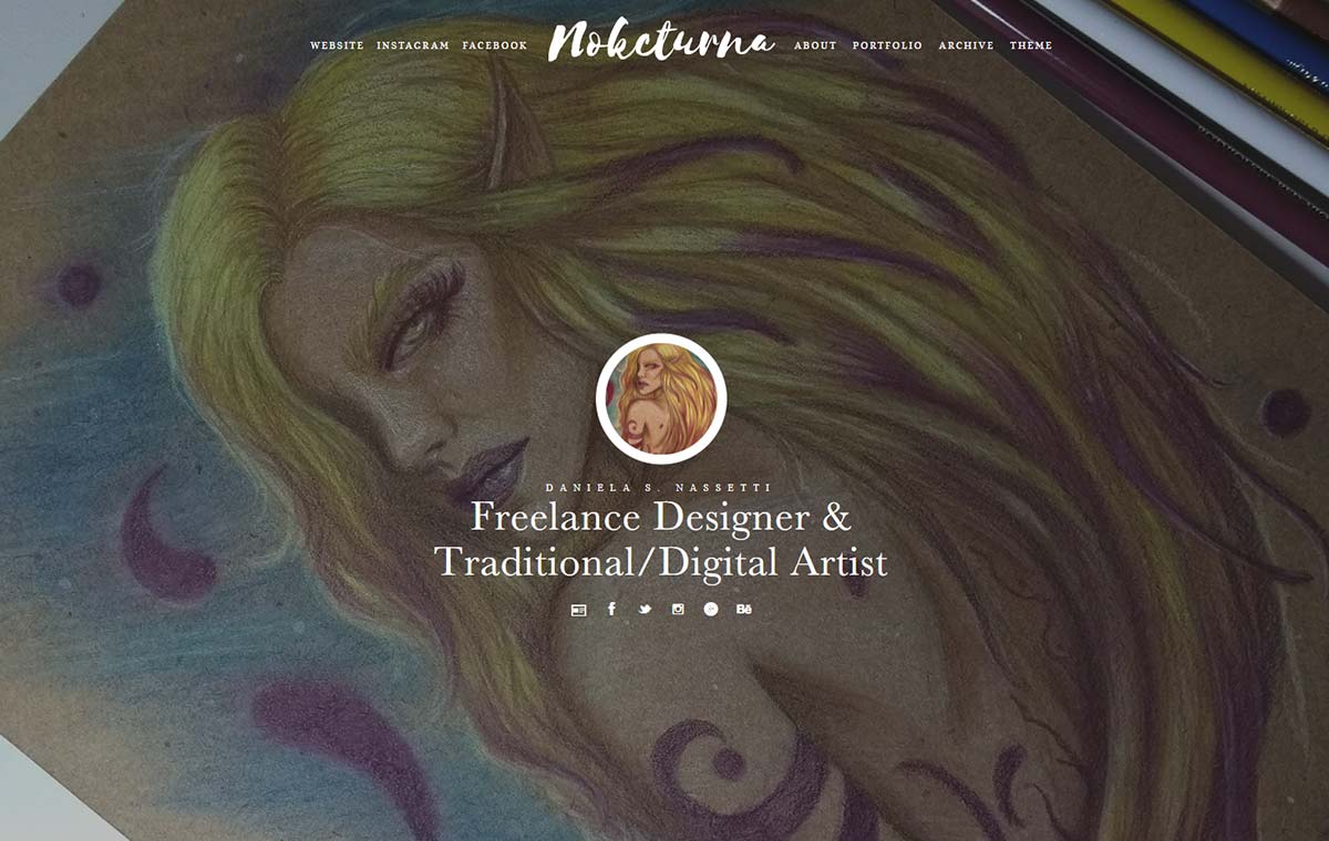
Oh, for a change, I made some modifications to the site here and there, haha. I also felt the need to put an end to my old logo. Today I feel that only Nokcturna makes more sense to me. A logo in a typeface, messy, loose in contrast to the old, accurate, millimetrically aligned logo. I don't feel like my “me” today identifies with him anymore.
I never imagined I would say that one day, haha. My old logo was perfect for years... but over time we felt this need for change. For a Designer like me, a logo is extremely important, an extension of your own self. Nokcturna It has been a part of me for years, both as an “artistic” name that caught on and because it is part of my own history. That's why in recent months I had already been testing it on the site, but it was time to embrace the idea, to embrace just that: a messy font that reflects my current work, focused much more on illustration and on loose, open creativity... bluntly, without limits. Livre.
I hope you enjoyed the post, guys! There will be more next week :)