And here we go to the 66th edition of the Drawings of the Week!
I, as always, am in the rush with web/visual identity projects, haha, but it's a good rush, at least. I haven't even posted web and visual identity projects for some time because even when I finalize one I want to wait for the client to finish all the legal process and finally put the site and/or logo up and running before posting. A matter of respect, of course. It would be very annoying if it happened that the clients' saw the project online before they posted it themselves first, hahah.
Now, when it comes to drawing, it's generally okay to post processes and everything else, unless the client asks you first, of course. Always good to check. That reminds me of when I did the drawing to the actor... when I showed him the progress of the drawing (it wasn't finished yet), he already posted right after that because he loved it, hahaha. I thought it was sensational. I'm always happy to see my clients happy with my work XD
Well, enough rambling. Shall we go to the drawings of the week? :)
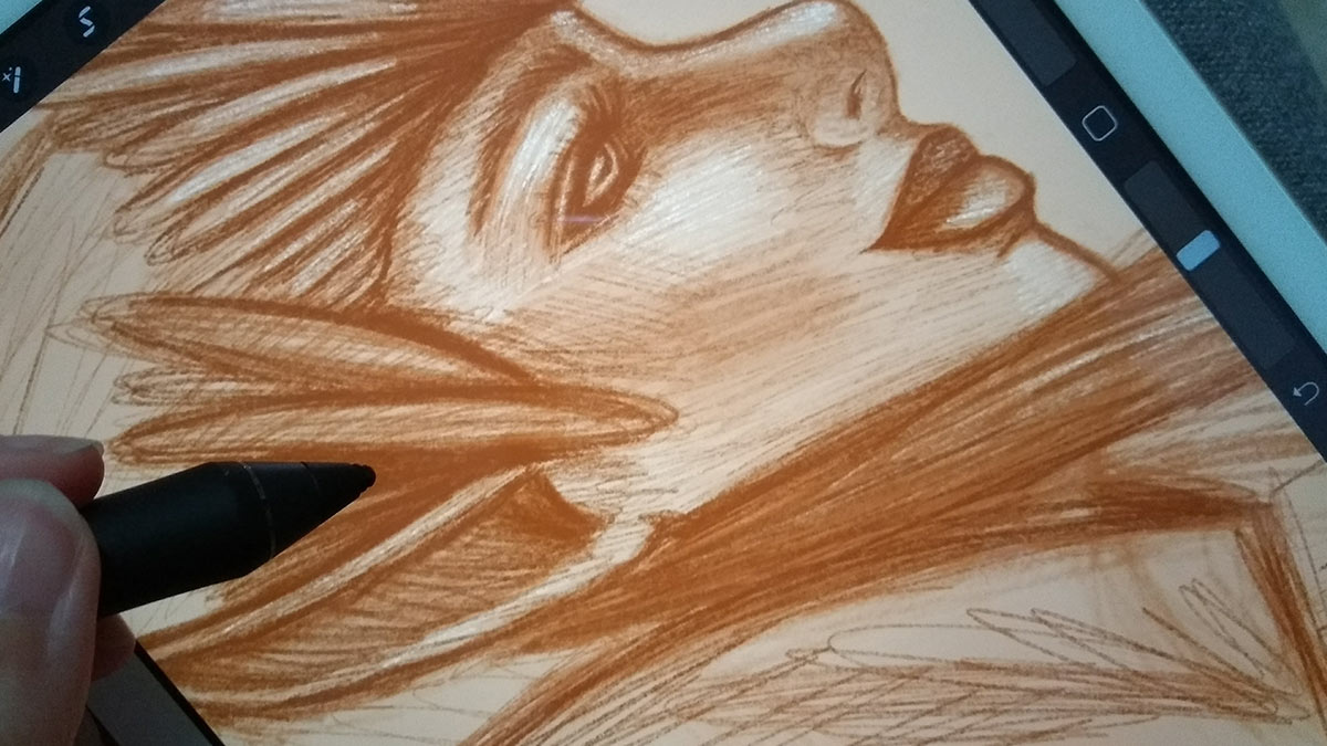
A digital sketch that I started on Procreate.
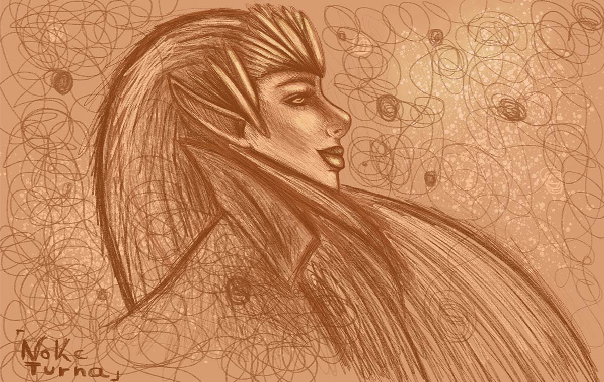
The finished sketch. I'm doing these digital sketches that are kind of loose and “aimless” just to keep testing the tools and see what brushes I like. Right now what I'm using a lot are the 6B pencil brush and the blending tool, haha. I like to make my own lines from the drawing, merge some and then redo them on top. I want to find a way my to do digital art too, because I don't want to do what most people already do. When I was doing digital art in the past, I used to follow the rules and the way of others... that's also why I decided to stop and stick to the traditional one, to find my own voice before everything else.
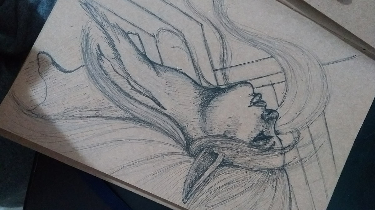
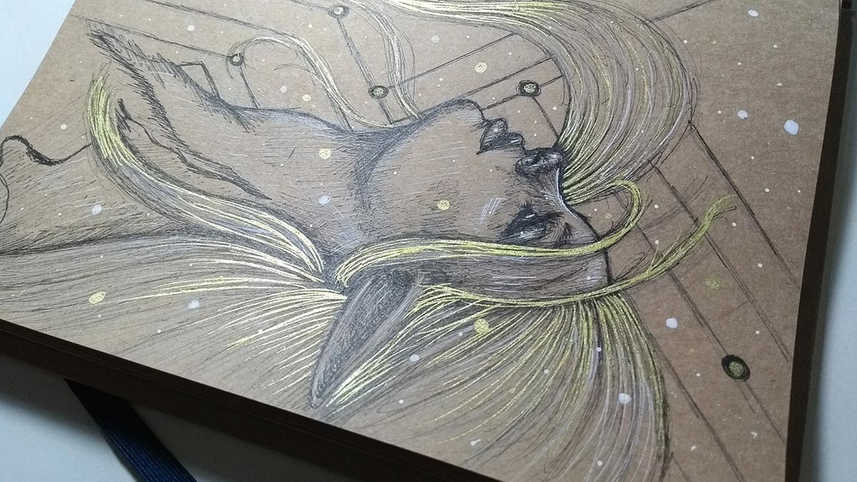
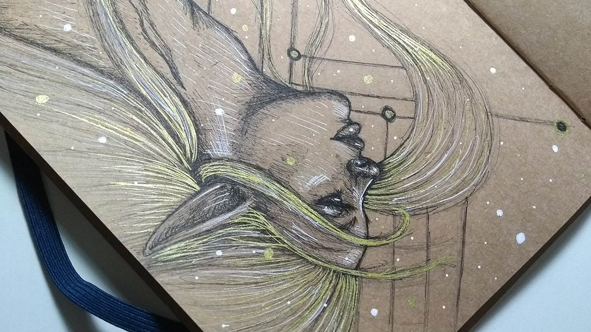
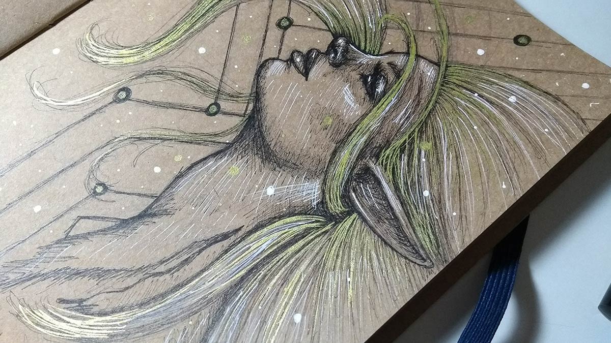
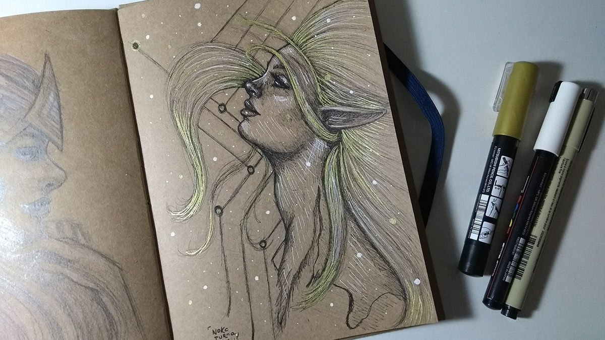
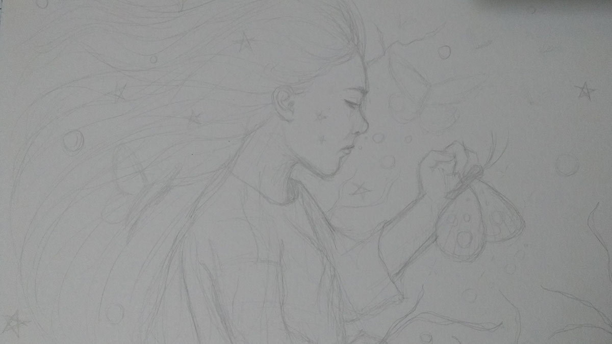
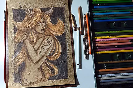
Sketch with ink pens on the kraft paper sketchbook.
I love using the gold pen, haha.
Finished drawing. In my current ink drawings, I'm seeking to moderate the use of the white pen and use it to really focus on lighting instead of doing what I was doing creating a lot of outlines. I would like to, but as we evolve, changes become necessary.
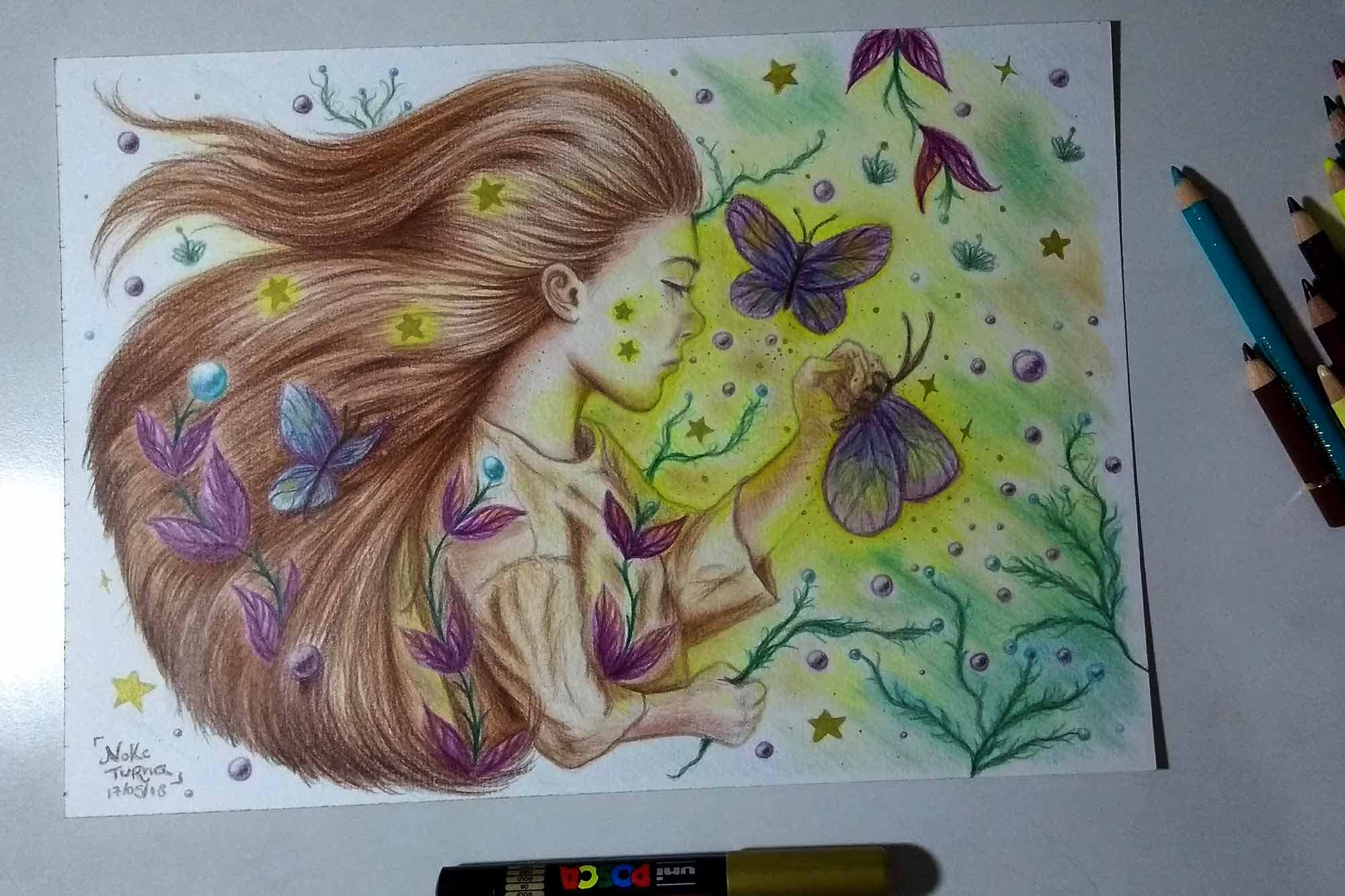
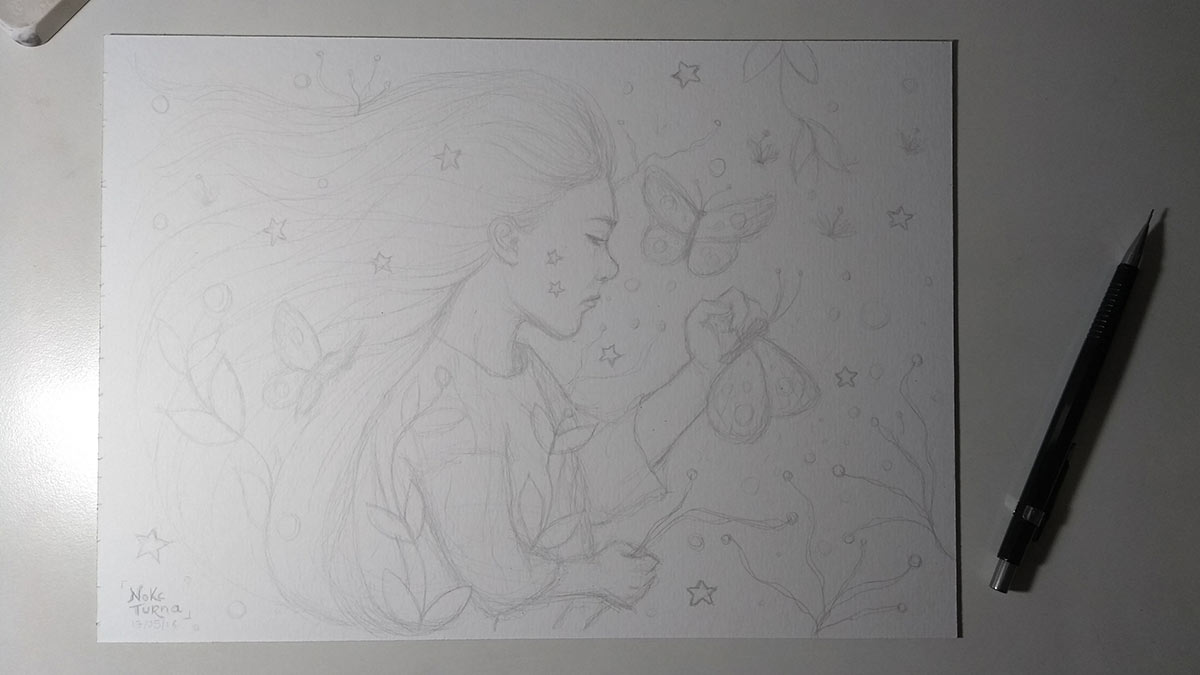
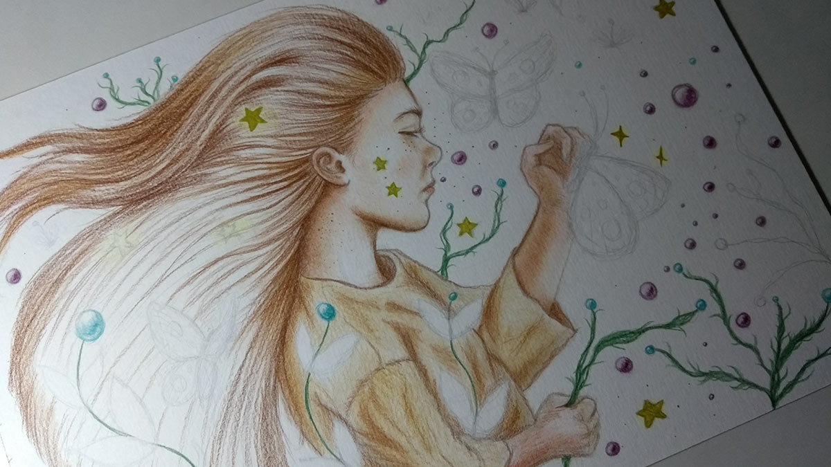
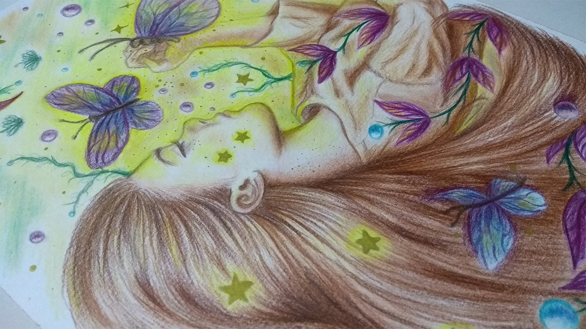
The finished sketch. I spent a long time on it because I wanted to make the composition as perfect as possible, hehe :)
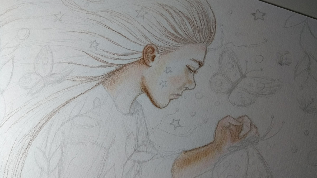
First layers of color. I always like to start with the skin, and then define the tones I'm going to use - which are generally: medium and dark brown for contours and shadows; pink for the cheek and mouth; and beige for some areas of the skin and shadows as well. The white of the paper serves as lighting and on kraft paper I use white pencils to create the lighting.
In the case of this specific drawing, the first time drawing/painting a child, I had to be careful with the colors so they don't get heavy and look like they're wearing makeup, haha. Also, before I start, I already think about exactly what colors I'm going to use. I highly recommend studying color theory, by the way. Knowing how to use colors to create contrast or the effect you want to impart to your art is essential. The Psychology of Colors by Eva Heller and From Color to Non-Existent Color Are Israel Azevedo's books Must Have not just for designers, but for artists too — and if you're here, you're probably both like me, hahaha;)
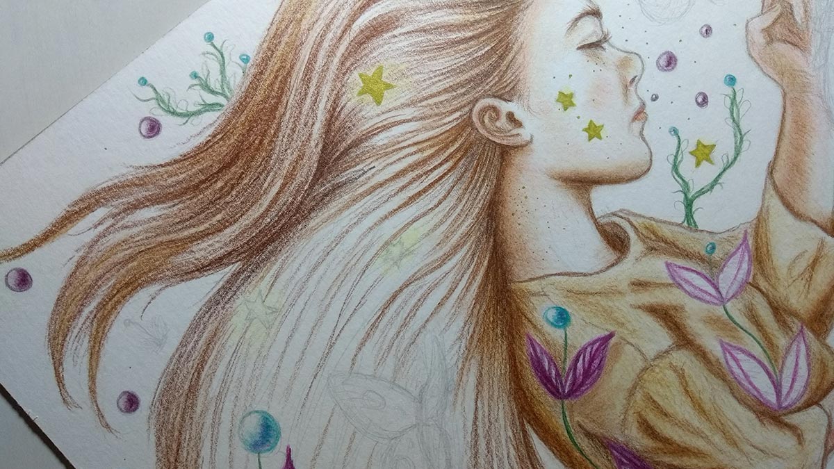
In the little stars I used my beloved gold pen, haha.
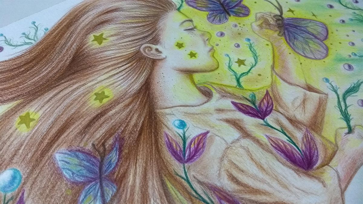
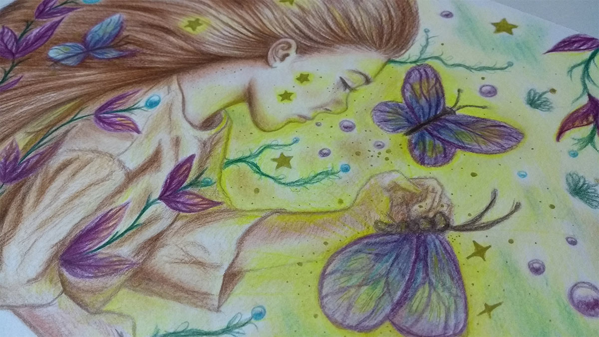
The idea for this design, in fact, came from a picture which I used as a reference for the pose and also to capture the expression of a sleeping child. I gave the name of Dream Child because it symbolizes the state of innocence and dream. The dream taking hold of the being, the butterflies that take you to this fanciful and colorful world. Surreal.
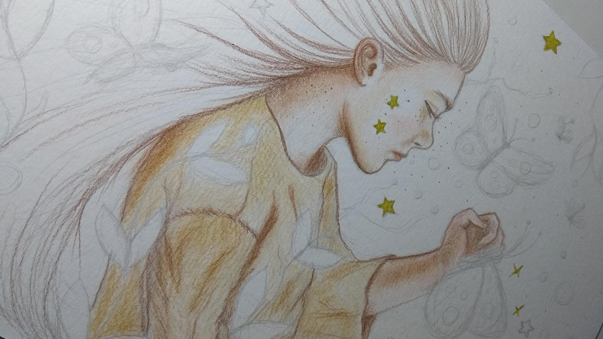
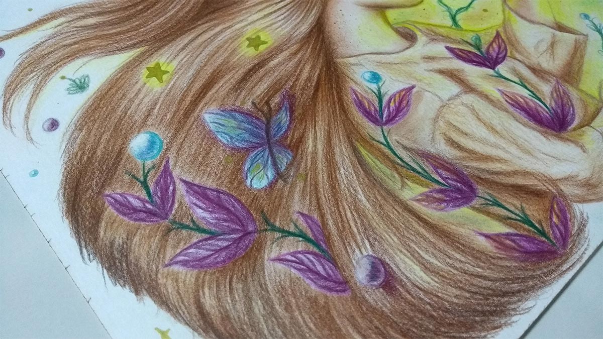
Since I used a lot of shades of yellow and brown, to create contrast I also used shades of purple and blue:)
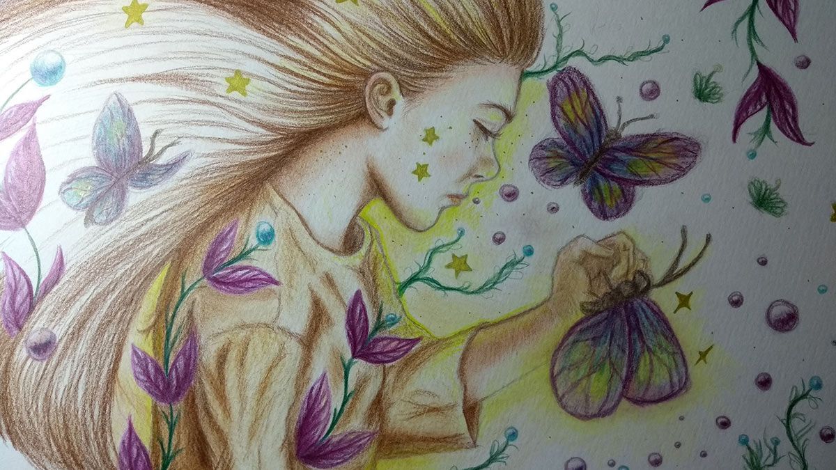
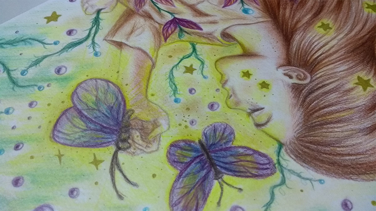
I don't always have in mind all the details of what I want to do. Sometimes the idea comes up while I'm doing it. In this case I decided to create a yellowish light that hits her face and part of her body, coming from the right side and consequently from the butterflies - to emphasize what I said above: the butterflies that take you to the dream. A way to go further and also create a composition in which everything is connected, so as not to seem like they are loose elements within a composition. That is why it is important to study color theory extensively.
I took the opportunity to reinforce the yellowish lighting also on the golden stars.
Purple on plants to create contrast with yellow (as it is a complementary color). In the butterflies I decided to create a mix of the colors I used: yellow, purple and blue. Some blue ones, even, you probably can't even tell (the spheres on the plants), haha, but I also used some purple in the shadows. It creates an interesting holographic effect.
I also reinforced some sparkles using the gold pen and more yellow outlines.
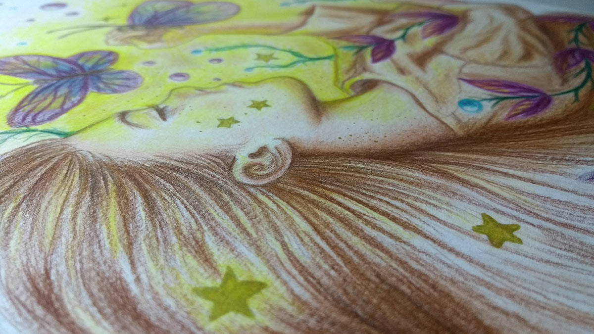
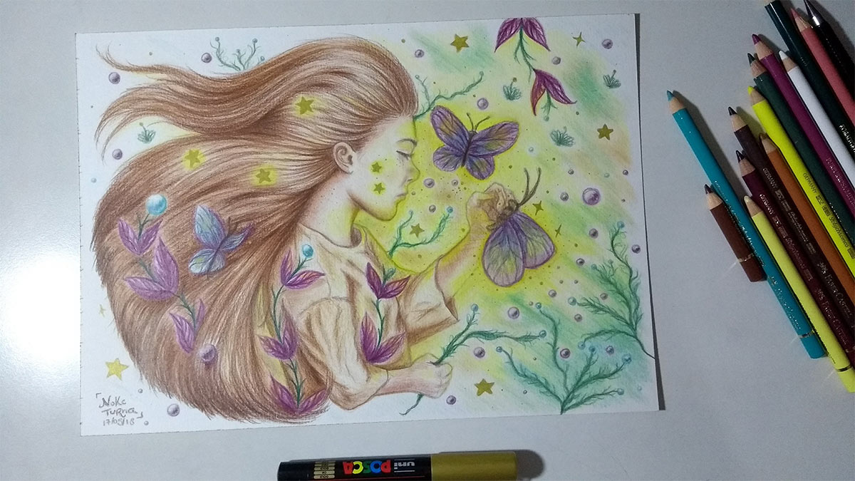
Finished drawing.
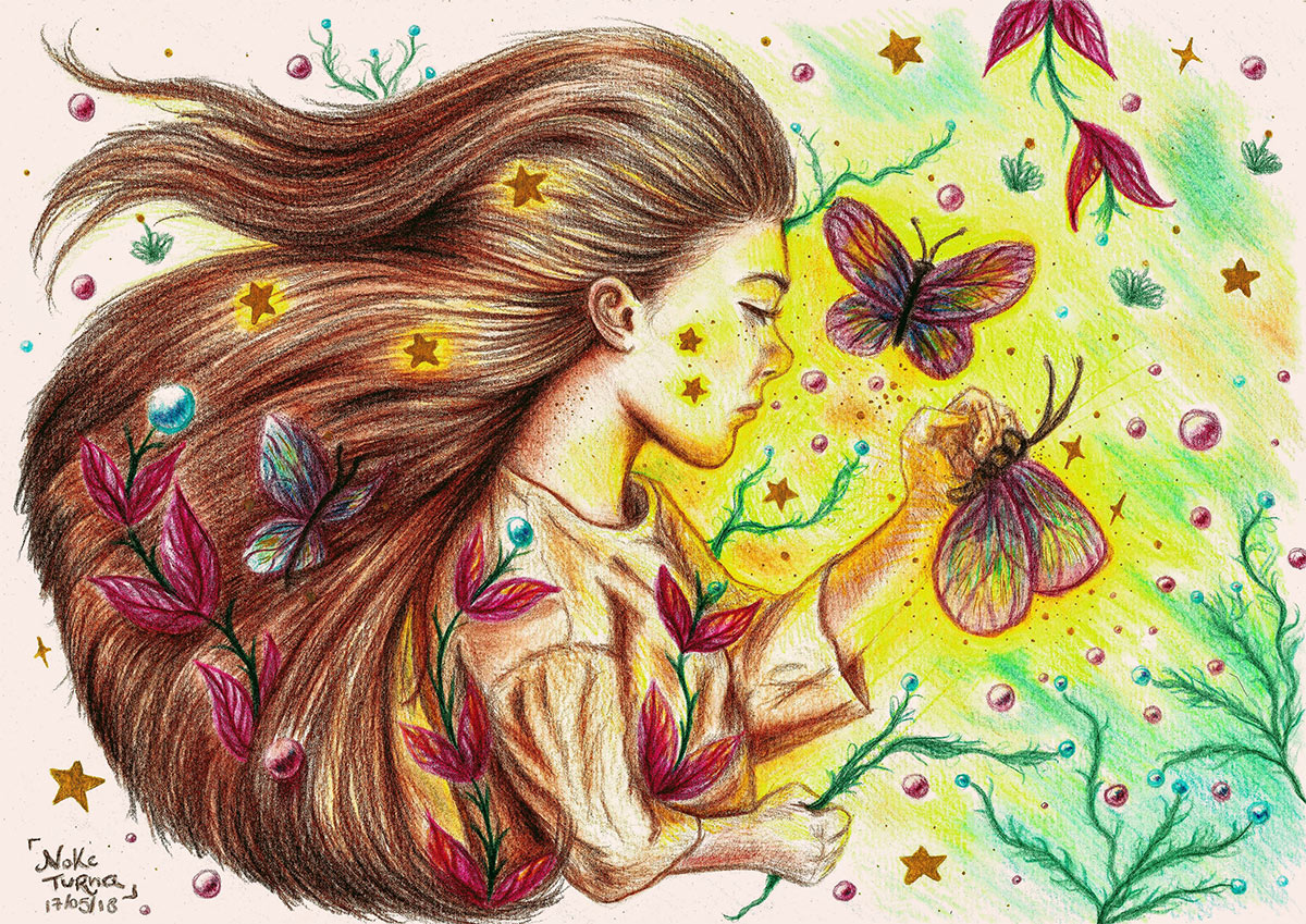
Dream Child It is now available for sale of art prints and other products in my online stores on Society6 and Colab55. In addition, I am creating another version to reinforce the colors - unfortunately, some are lost when digitizing drawings. After scanning, I usually only edit to recover a little more contrast and colors (something light and necessary). Any day I'll make a post showing how I do this). I don't like to edit too much so as not to lose the essence of being a traditional drawing, of course, but in this case, after doing some tests, I realized that I could go a little further and that's why I will soon create a second version with even more vibrant colors. I will sell both versions in stores.
Version with more vibrant colors. I'm still in the testing phase and I want to test the print first too, so it doesn't get too dark when printing. As soon as it's ready, I'll let you know and post it on the networks, of course :)
Well, that's it, guys. I hope you enjoyed today's post! <3