I drew little this week... I'm about to finish a web project, in addition to some personal projects as well, and other than that, I've been sick in the last few days. I think it was something I ate, I'm not sure. I even planned to draw more over the weekend, but with this problem I ended up not being able to:/but next week I hope to get better soon and come back with everything, haha!
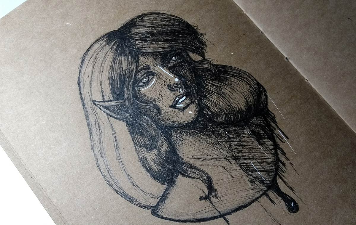
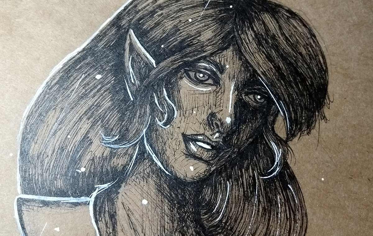
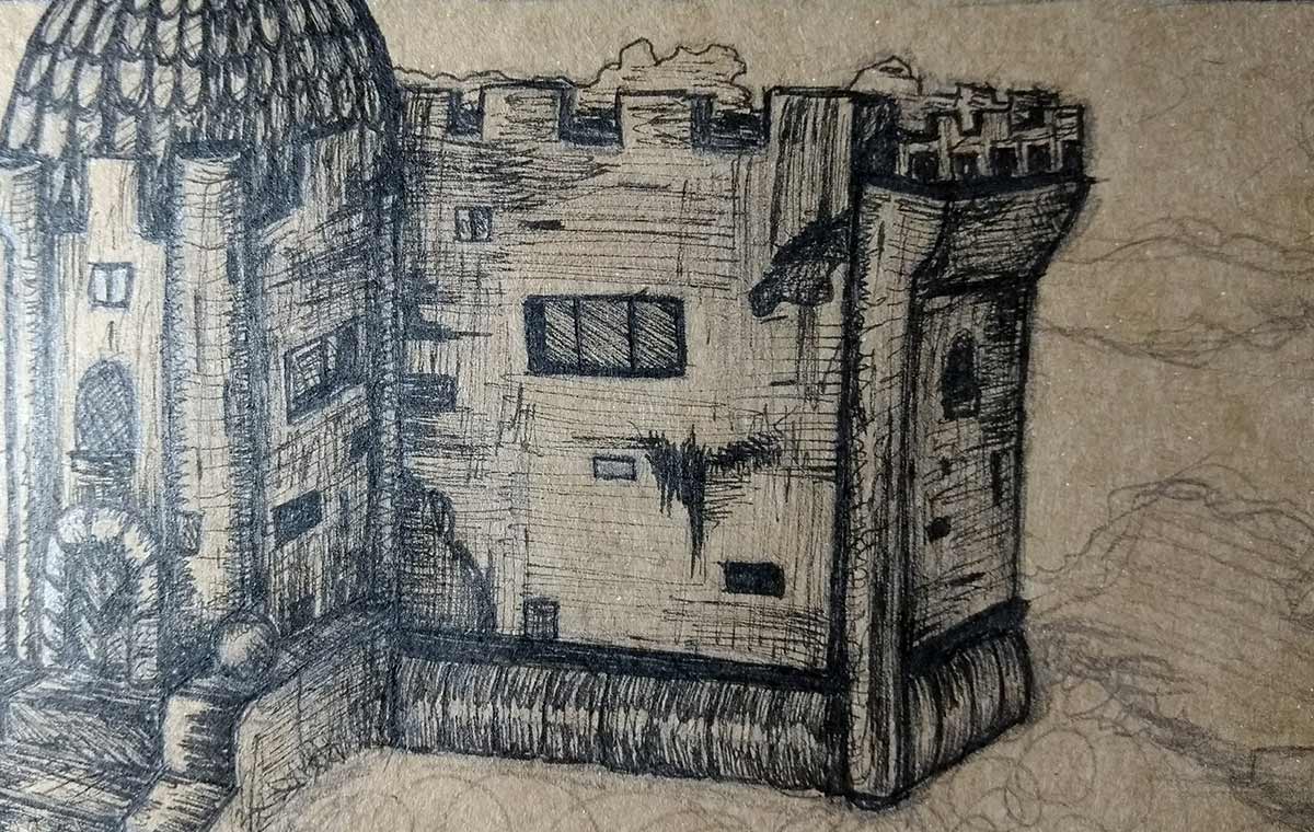
In this doodle I wanted to play a bit with the contrast, to abuse the shadows. I already feel at a comfortable level in light and shade — it was even the first thing I tried to learn a lot when I started drawing in 2013. Despite this, sometimes I am afraid of abusing the shade when using ink pen, so I decided to test with this one.
I love making loose and messy lines, it's really part of my style, you know? Really abusive, hahaha. It was a cool workout, even to test different lighting/shade. I highly recommend doing this type of exercise when you're more comfortable with light and shade.
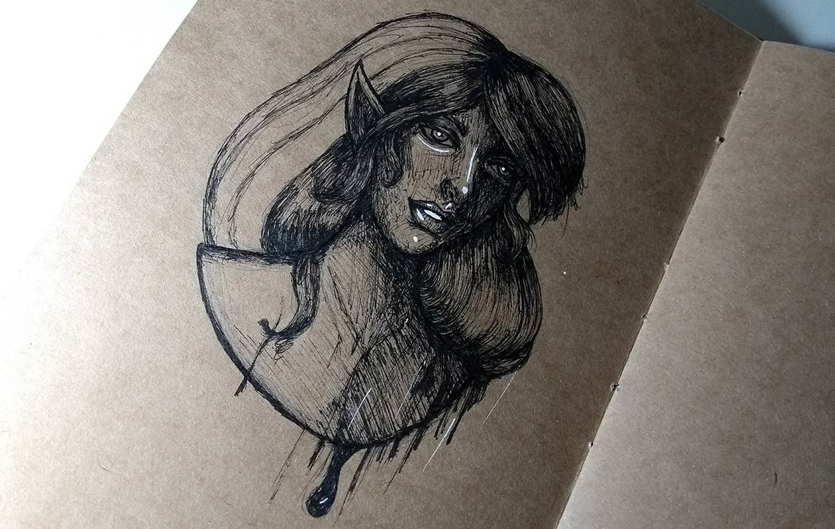
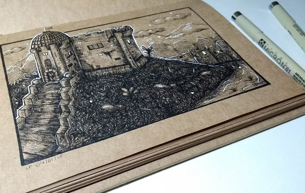
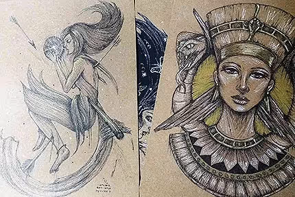
Finished drawing.
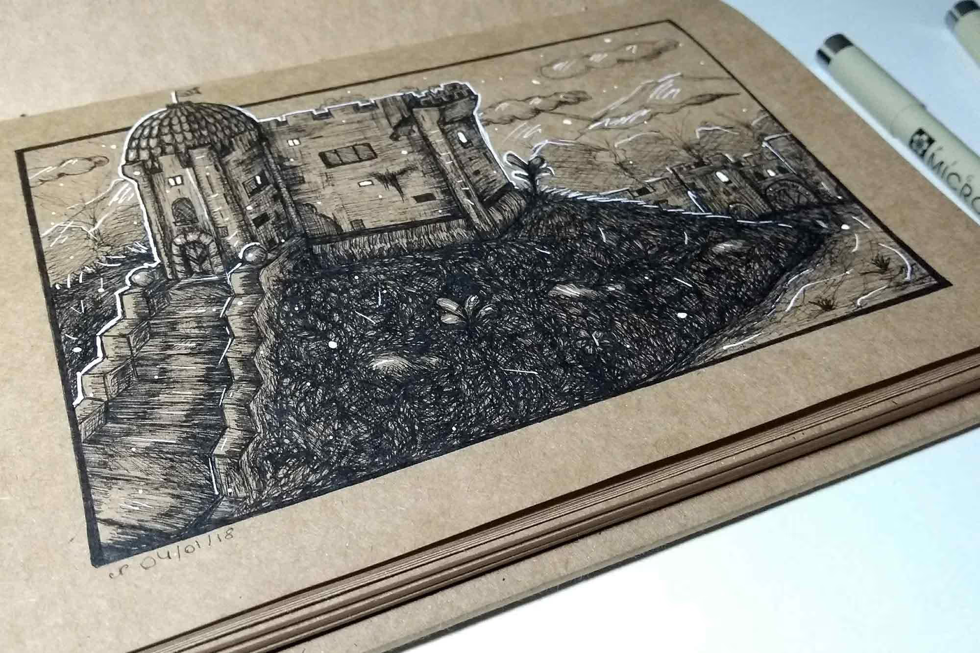
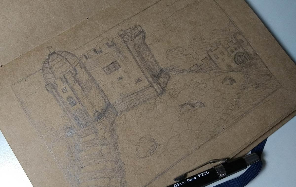
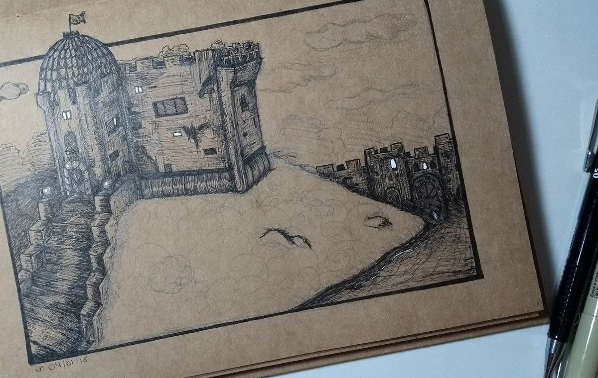
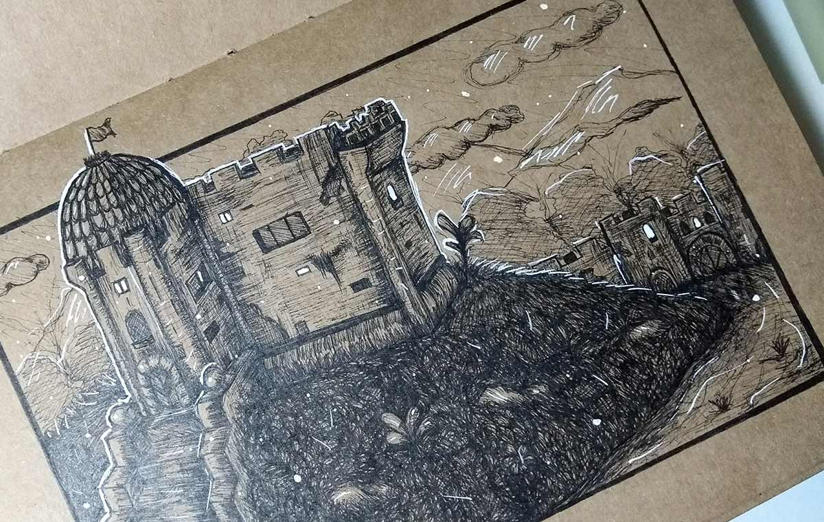
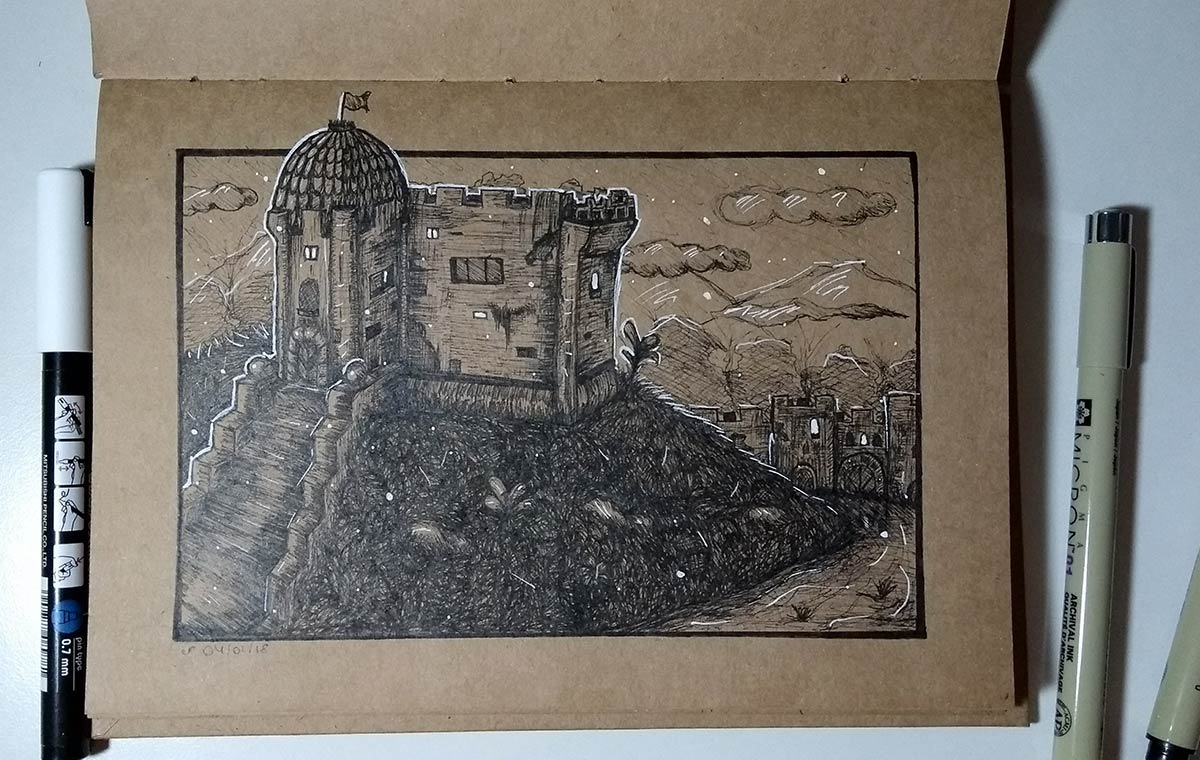
Sketch of a castle. Since I don't usually draw environments and castles much, I decided to try something here. I confess that I'm not a fan of perspective. Not that I don't understand how to do it, I do, but I think the whole process is very boring, hahah, so I'm looking to develop my own way of dealing with it, while learning more.
My drawings tend to be extremely loose, that's the way I really like to draw. It was no different here either. To alleviate the fact that I'm not a fan of perspective, I tend to use space to my advantage, always remembering to leave objects closer to the action more detailed and darker and more distant objects lighter and less detailed. This gives an incredible effect and you can really see the depth. On the ladder, I even did a bit of perspective right in my hand. I even noticed that I ended up unconsciously applying a different way of working, a perspective that I learned when I started the Graphic Design course at Panamericana in 2013. One day I'll do a tutorial here, it may help those who, like me, don't like being forced to work with rulers and the like, hahaha:)
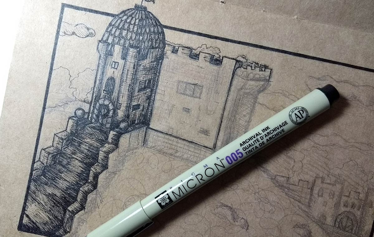
Whenever I work on the details with a ink pen, I like to use the 005 pen from Pigma Micron. It's very thin and helps a lot to control the details. When it runs out (which usually happens quickly because I use it a lot, haha) I use 01 anyway. It's a bit coarser, but it works in case 005 ends.
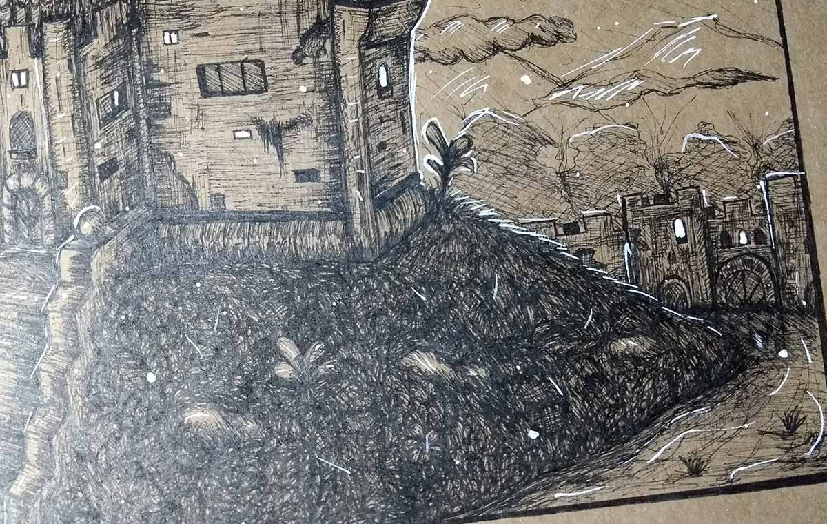
I had a lot of fun creating the details and cracks in the castle:) I do Shapes basic and then lines inside (as if it were an old fashioned game, you know?) to create the effect.
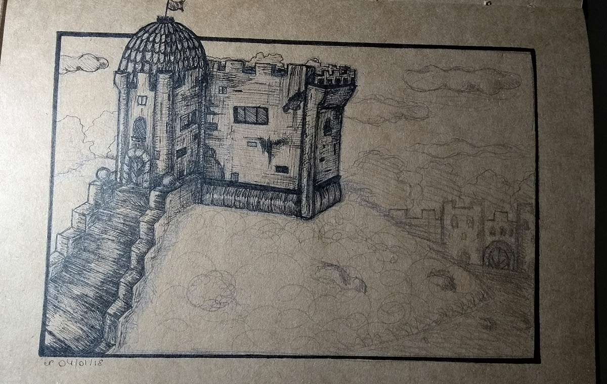
Closer photo so you can get a closer look at the details.
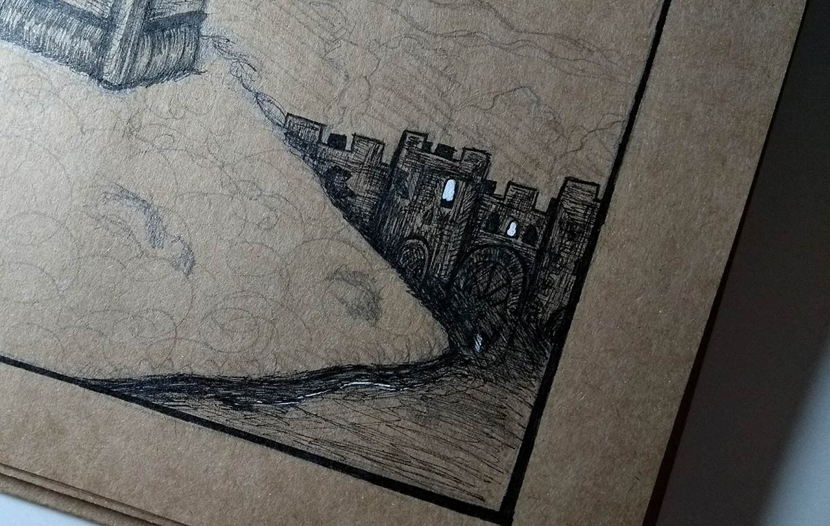
At the back of the castle, I decided to make it surrounded by a lake. I ended up not detailing this so much and I don't know if you can understand it well, haha, but I tried to reinforce the idea that it was water creating the reflection of the gate. The small glare reflected from the window into the water was with the UniPoSCA pen (I use it to make the white parts in my drawings). In this case, I went over 005 on top to make it darker. I was very happy with the result XD
I left the part of the grass surrounding the castle last because I was still not sure what I was going to do with regard to the details, plants, etc.
As I said above: the details in the background (clouds, mountains, trees, etc.) I tend to leave very light to create that depth effect that I mentioned:)
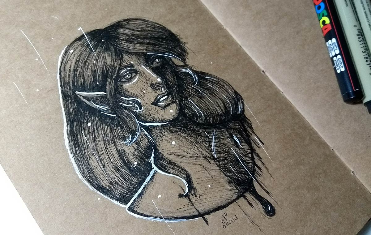
Finished drawing :)
Well, despite the few drawings this week, I hope it helped you with the tips! There will be more next week, of course!
NOTE: Have you already signed the newsletter? I recommend it if you don't want to miss any updates here on the site, apart from the fact that subscribers get a special gift starting this year! ;D